BUTTERFLY
GARDEN
Event Date
Jan 2019
Role
Concept design
Experience design
Illustration
Team
5 designers
2 engineers
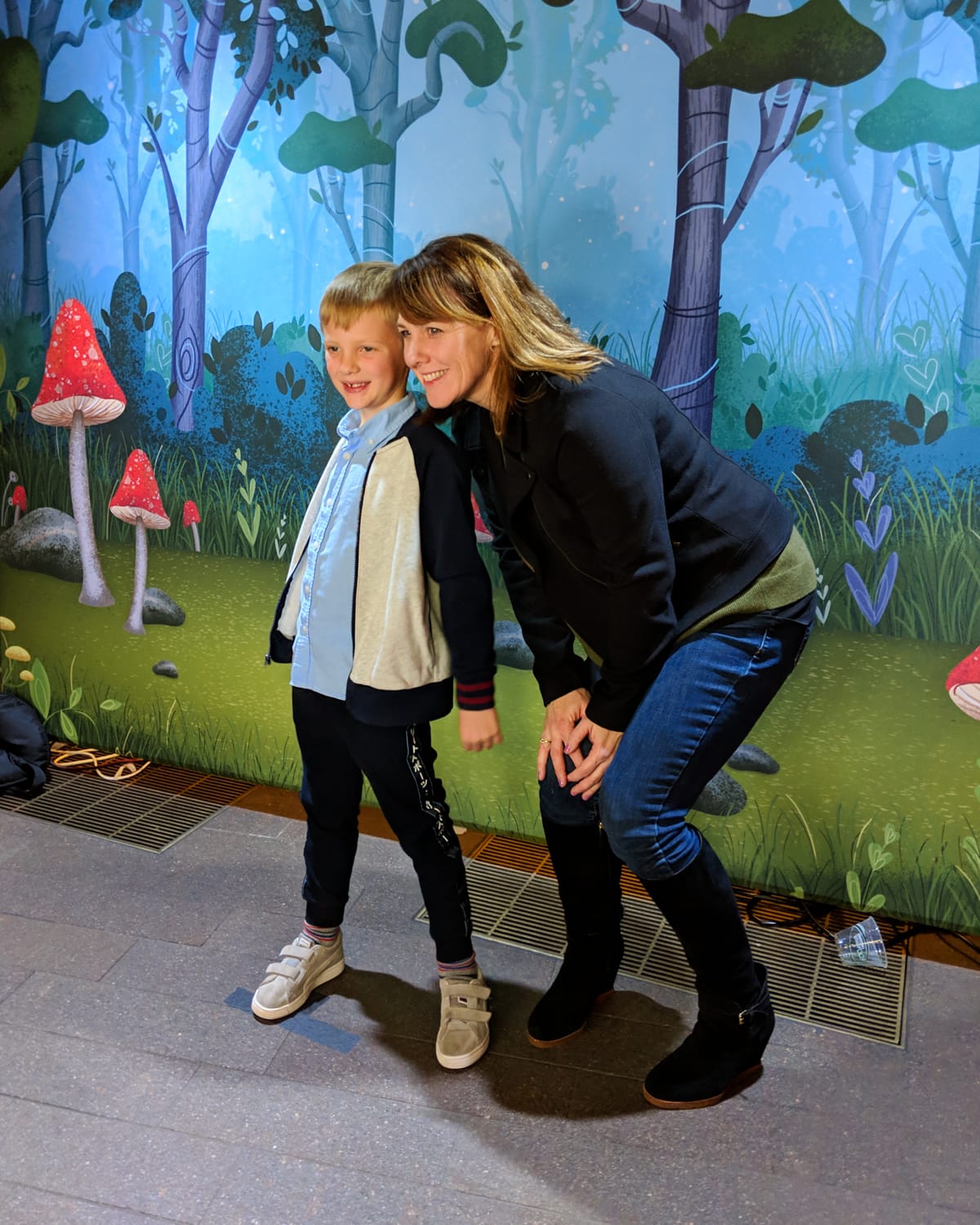
As a pro bono project, I co-created an augmented reality photo booth for the annual Art Party at the deYoung Museum.
The deYoungsters Art Party is an annual, family-friendly fundraiser held for the deYoung Art Museum in San Francisco. As one of the lead sponsors of the fundraiser, Adobe was asked to host an activation booth during the party. With less than 30 days to make it happen, a small group of volunteers and I quickly assembled to design and build an interactive exhibit.
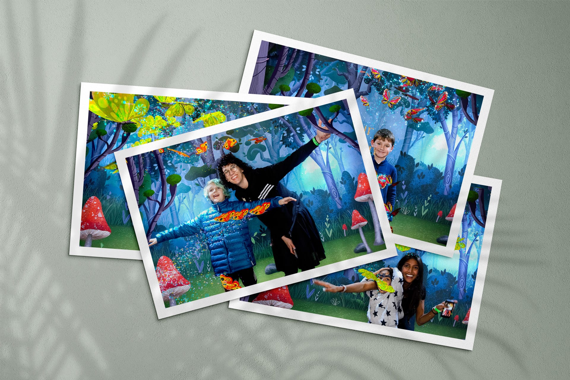
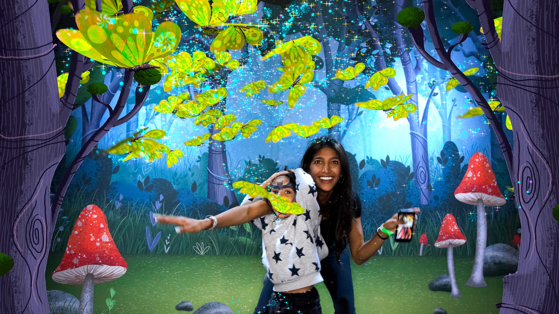
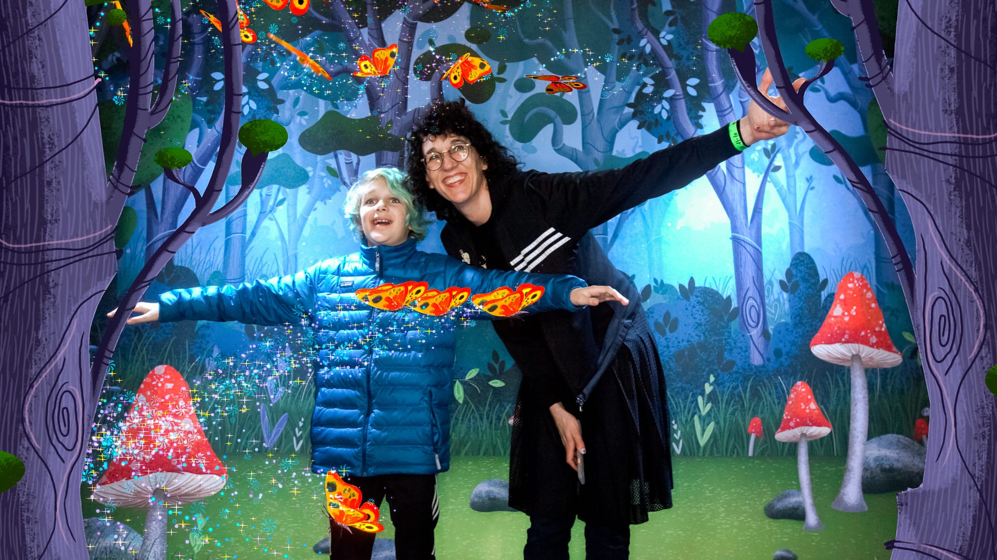
We created a multi-part activation where children’s butterfly drawings were animated in an augmented reality photo booth and live display wall. Party guests were given instant print-outs of their photos as a memento. I was primarily responsible for the overall concept and illustrating the 3D scene for the butterflies.
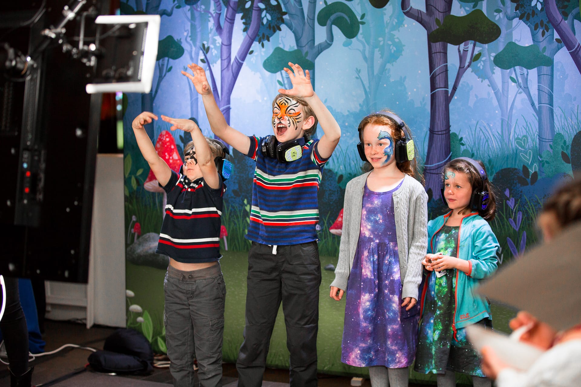
Gallery Party guests pose in the AR photo booth.
"Your magic activation at last night’s Art Party was incredible. I thought the backdrop was actually art from one of our collections."
Board member, deYoung Museum
01 - Overview
01 - Strategy
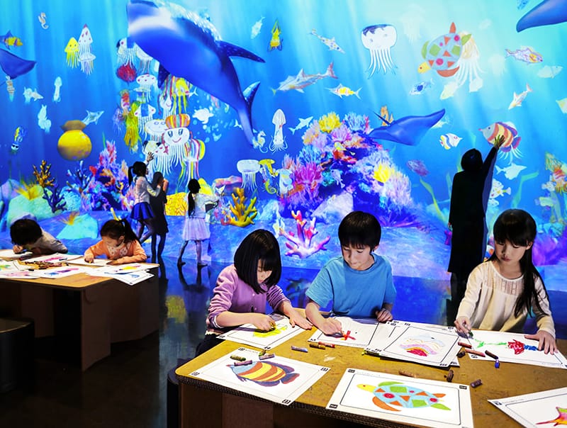
Fig 1 © Copyright teamLab 2013
Defining the concept
Since the event coordinators did not have a specific theme in mind for their 2019 party, they gave us full freedom to define a concept. We were really interested in participatory art and empowering children to view their own work in a museum setting. We were especially inspired by the Sketch Aquarium installation created by teamLab (Fig 1).
We developed a similar concept where children’s butterflies would be brought to life as a collaborative exhibit. Our pitch was presented to the museum event coordinators organizing committee and given a green light to build.
02 - Concept
Experience flow
Color
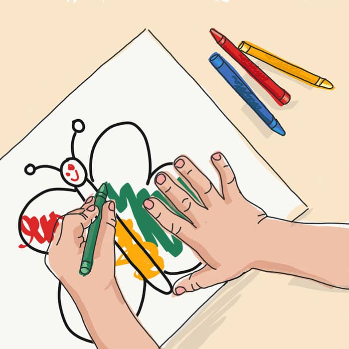
Child participants complete a butterfly coloring sheet. Each sheet comes with a unique scanning code for identification.
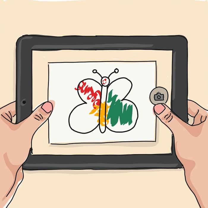
Scan
The drawing is scanned and brought into Unity as the texture of a butterfly object. The wing pattern is repeated on both sides.
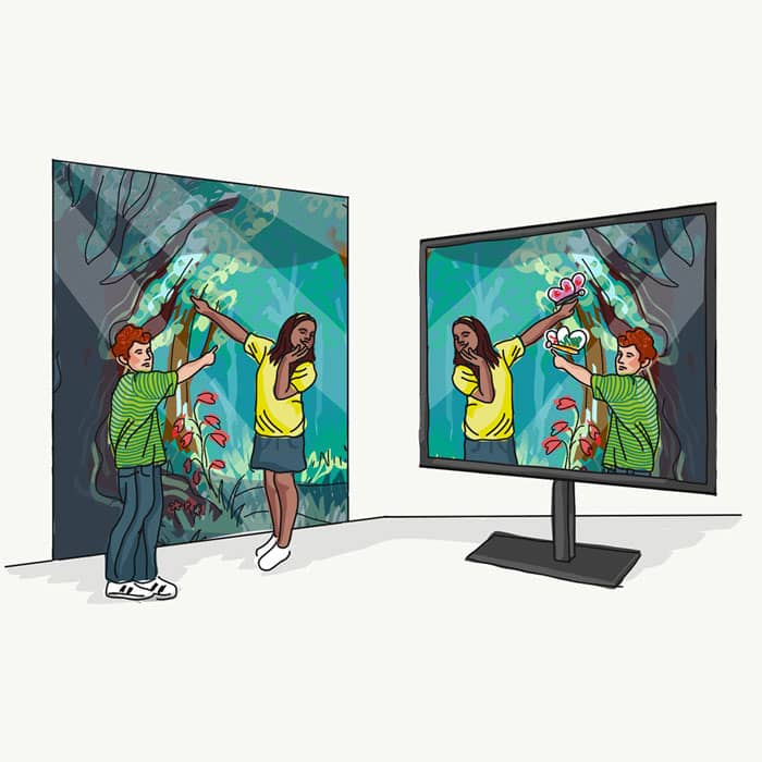
Play
Children pose alongside friends and family in a photo booth with their butterflies. Using live body tracking, the butterflies land on participant's arms.
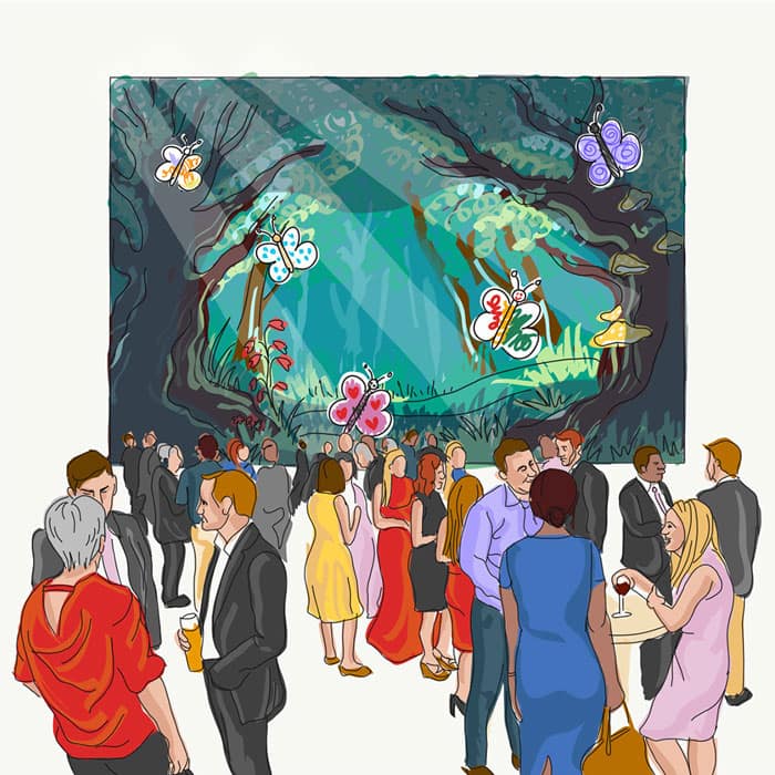
Showcase
All of the butterflies from throughout the party are collected in a second live environment broadcasted in the venue on the large screen.
03 - Design
Building the scene
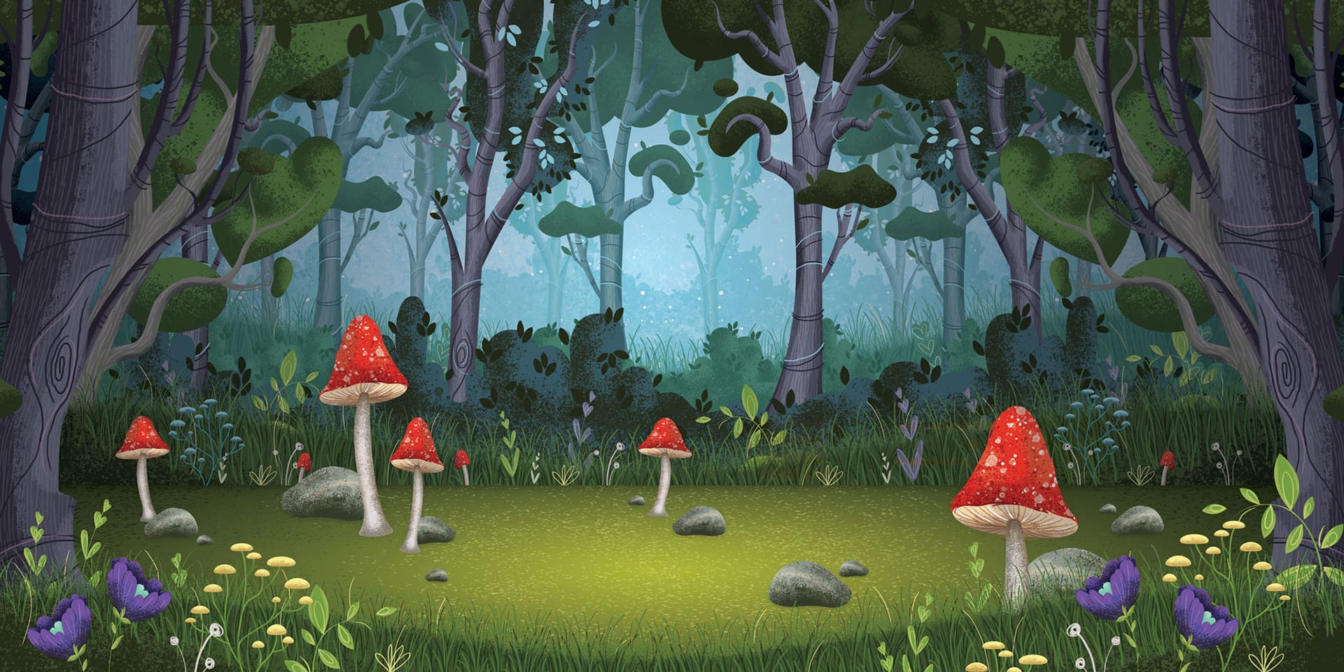
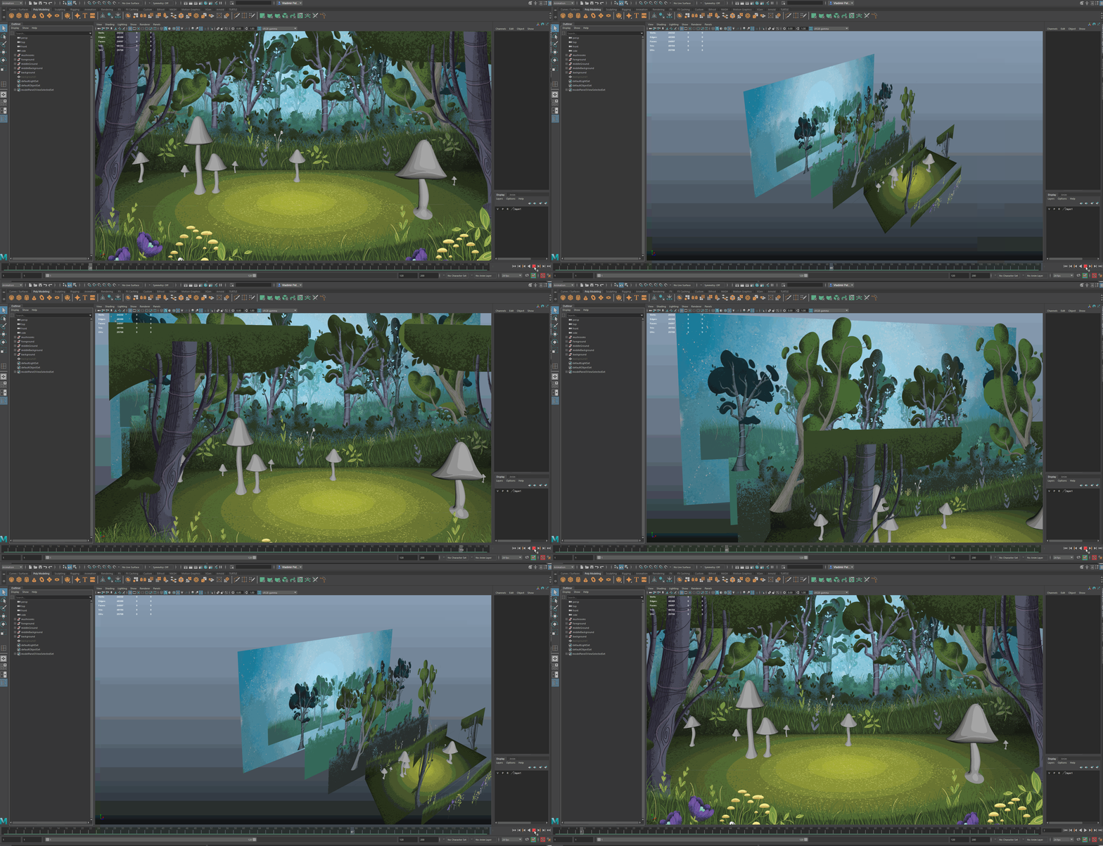
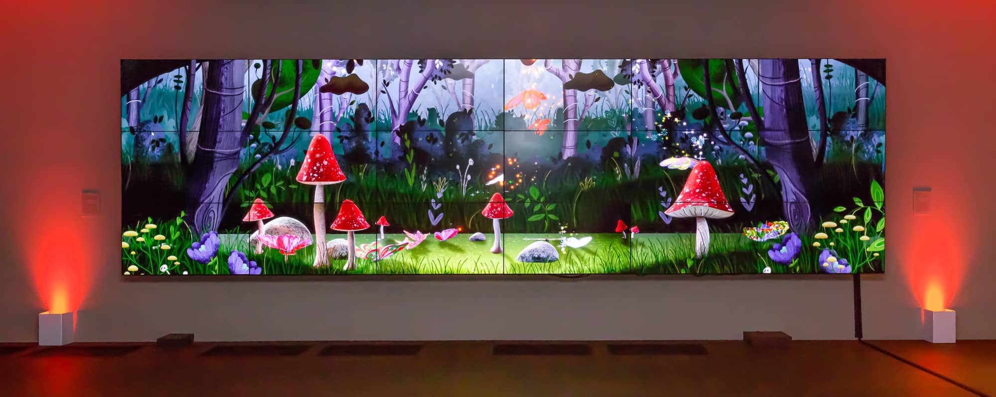
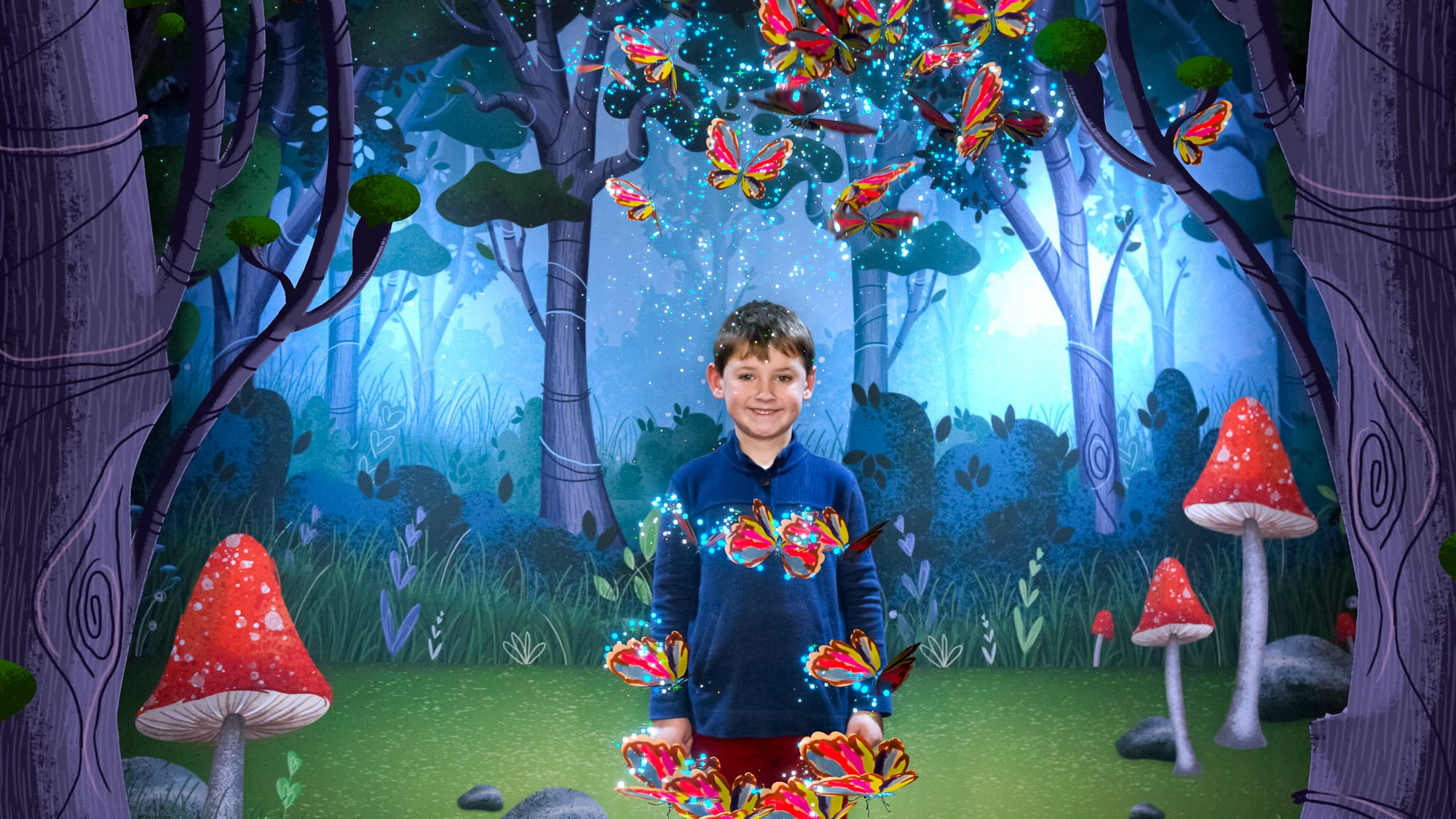
The basic foundation of the experience was a forest environment. For the style of this scene, we wanted to create a whimsical and fantastical storybook feel with rich detail and dramatic lighting. We wanted the children’ magical feeling of seeing their work come to life to be matched by a magical landscape.
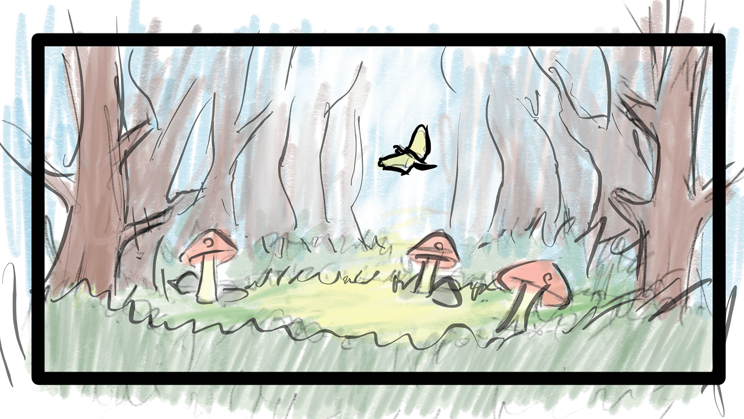
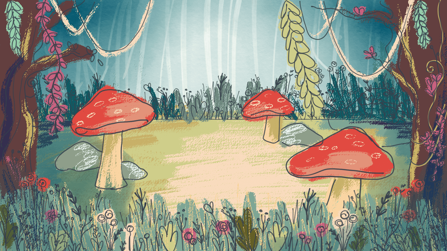
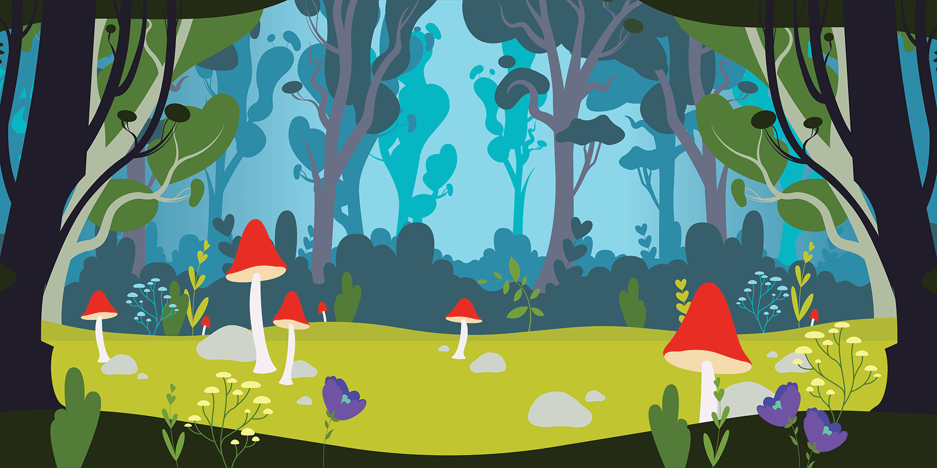
Step 3 I created vector shapes in Illustrator, then added texture in Photoshop. Layers were carefully organized to export the necessary UV maps.
With the quick project turnaround, we didn’t have the time to model a complex 3D scene. Instead, we opted to model a few key objects for the animated butterflies to interact with and build out the remainder of the scene with layered planes. This 2.5D effect played perfectly into the storybook aesthetic.
Step 5 James Hurlbut, our developer, added butterflies and lighting effects to the scene.
04 - Production
Hosting the event
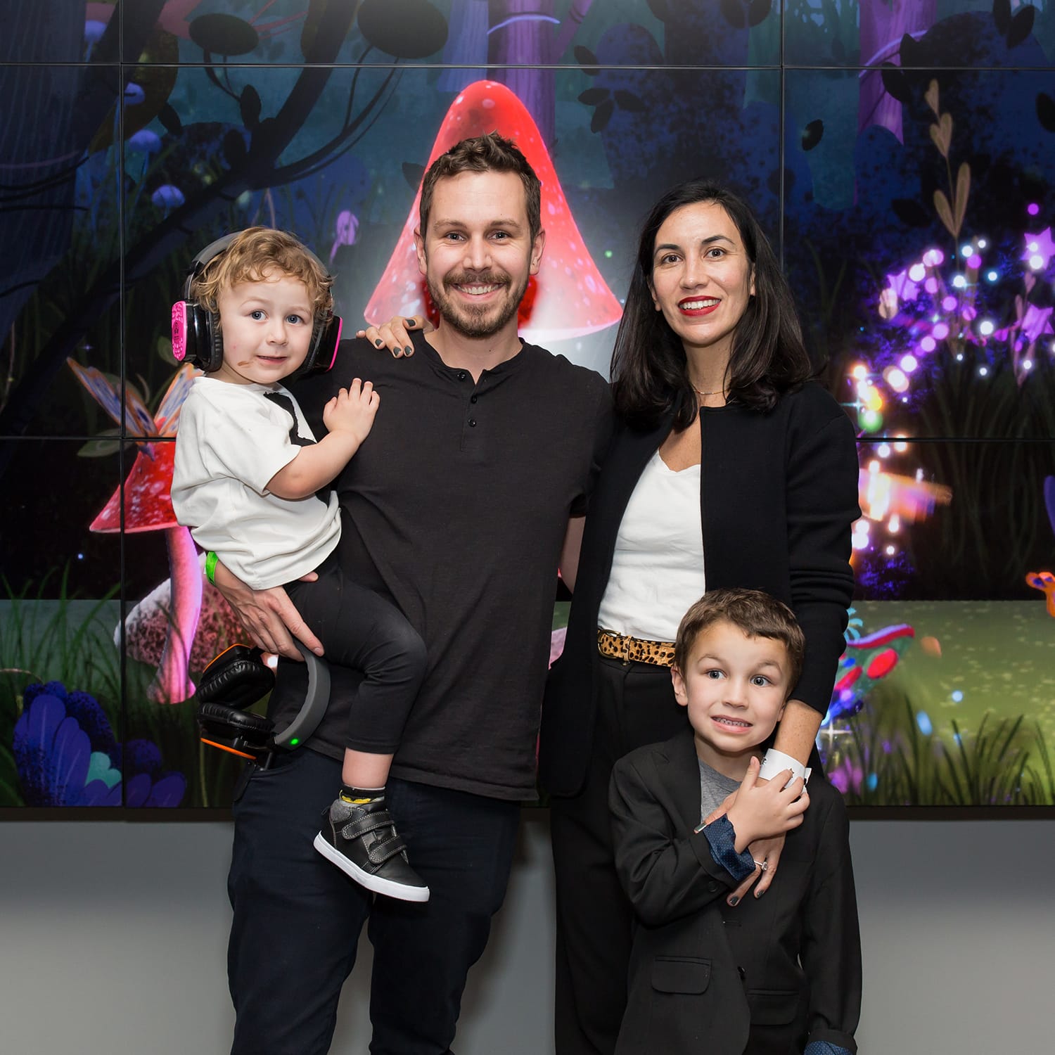
On the night of the fundraising event, our butterfly activation was a major hit with kids and parents alike. It was personally satisfying to watch kids excitedly search for their butterfly on the big screen and proudly point it out to their families. One toddler even sat on the floor in front of the screen in awe for 30 minutes!
Gallery Kids spent time at the coloring table, then hit the photo booth with their families.
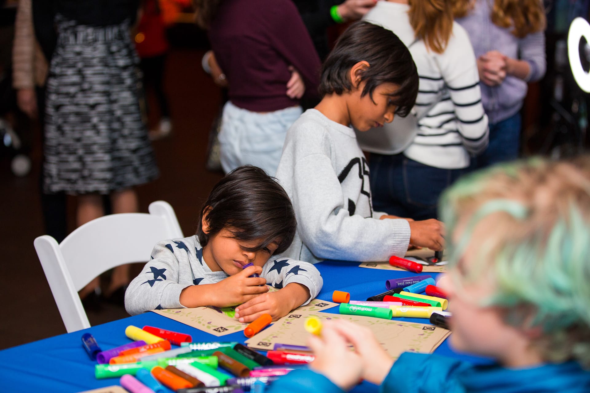
Despite a few Unity crashes along the way, the overall flow from paper to digital scan to photo booth worked well. We had considered using a set of iPads for the coloring portion of the process, but luckily we choose not to. Analog paper and crayons proved broadly approachable for a range of ages and allowed many more kids to color at the same time without the pressure of time restrictions.
Brooklyn, NY
kelly.a.hurlburt@gmail.com
585.689.9792
Have an opportunity in mind?
