CREATIVE
SYSTEMS
Ship Date
Oct 2020
Role
Lead design
Competitive analysis
User research
Product strategy
Team
2 designers
2 product managers
2 engineering teams
10+ stakeholders
Evolving Creative Cloud Libraries and XD Design Systems into a unified platform for shared design elements across disciplines
For years, design systems have enabled UX teams to design products consistently at scale. But while UX designers often work with a range of other creatives (brand designers, illustrators, content creators, and more), design systems have largely remained trapped inside of UX tools. At Adobe, we believed that teams needed a broader solution that would bring the power of design systems to all creatives disciplines. We dubbed this new category “creative systems.”
At the onset of the Creative Systems initiative, Adobe had two competing solutions for asset consistency and reuse — XD Design Systems and Creative Cloud Libraries. I spearheaded the design effort to merge these two services into a single platform capable of supporting multidisciplinary teams across the Creative Cloud suite. This case study highlights the core challenges of integrating creative systems into Creative Cloud’s UX design tool, Adobe XD.

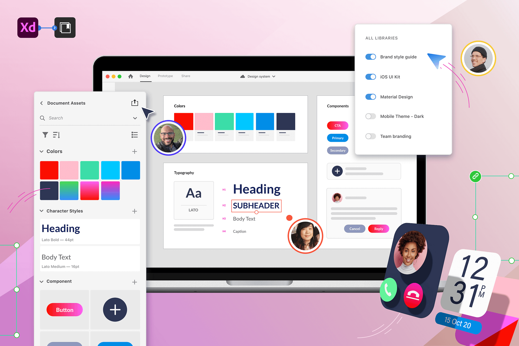
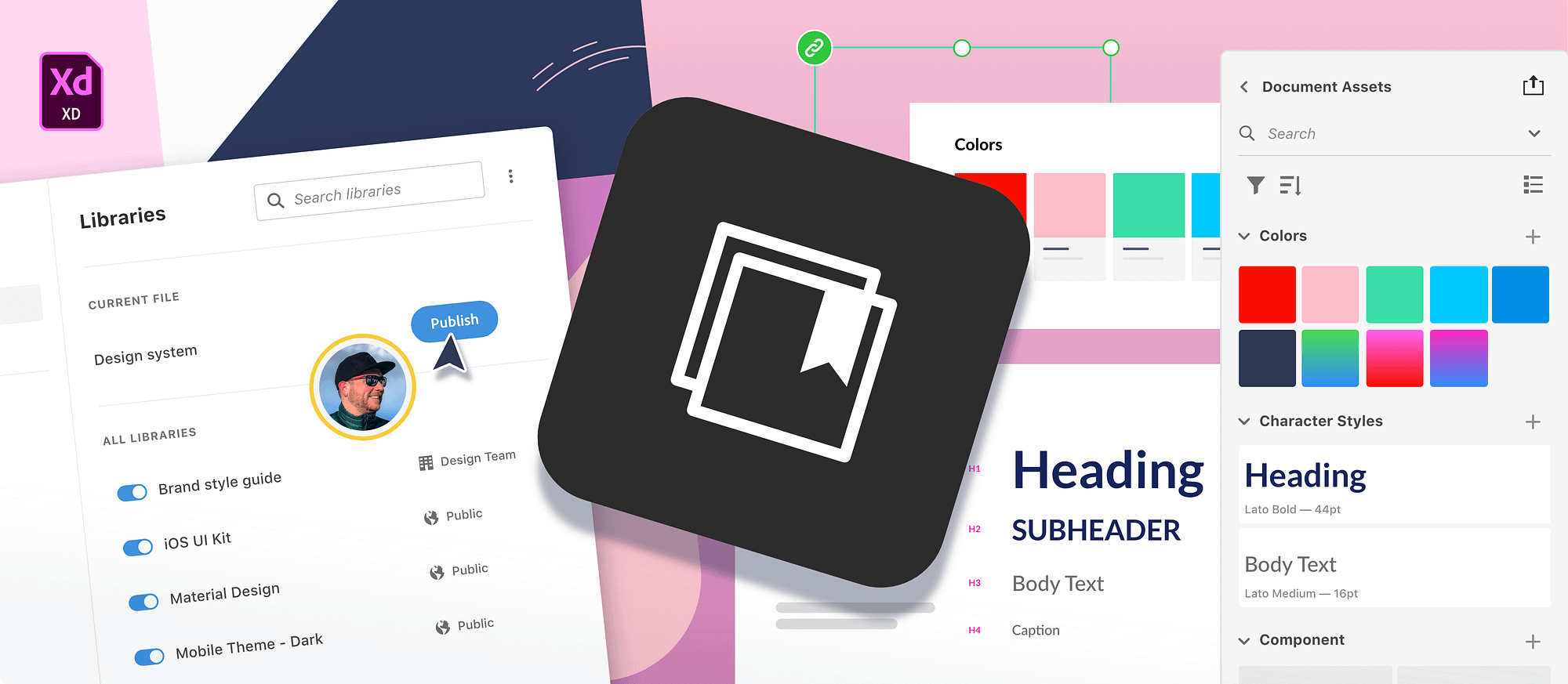
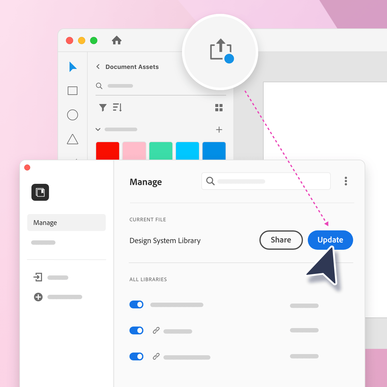
Publish library
Publish your document assets as a library to share with others. The library will stay connected to the source file and will be accessible across Creative Cloud apps.

Push & pull changes
Send changes from the source file to the library. Preview and control when you pull changes into your own work.

Manage libraries
Keep your app workspace focused by switching your libraries on/off.
01 - Strategy
01 - Strategy
Choosing the right platform
To determine a unified strategy forward, we first audited the existing experiences of XD Design Systems and Creative Cloud Libraries. Both services had similar panel UIs in Adobe XD, but they offered different features and levels of support for element types and applications.
Libraries were the logical starting point for creative systems since their feature set was more robust, and they were already integrated across Creative Cloud apps. There were crucial aspects of XD Design Systems, however, that would need to be retained in order to make a multidisciplinary platform successful for UX designers.
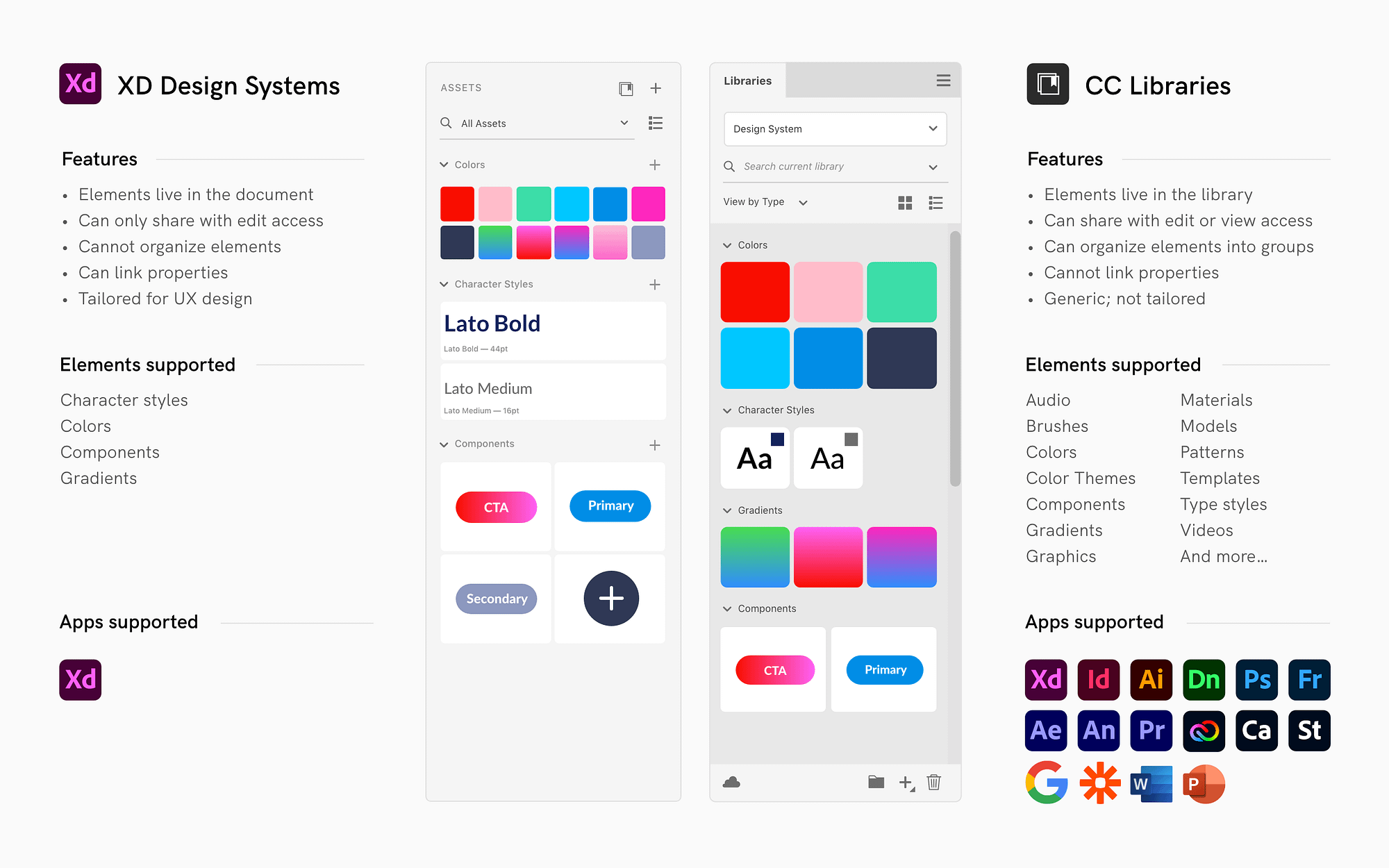
Chart comparing XD Design Systems vs. Creative Cloud Libraries
02 - Analysis
Identifying the needs & gaps
Experience review and goals

Working well
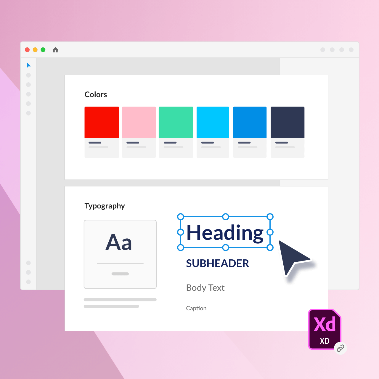
By building their system in a single file, designers were able to link style properties to components, make bulk changes, and provide instructions in-context.

Maintain context
Allow designers to share their system across Creative Cloud apps while using the source file to maintain the design system.

Needs improvement
XD files could not be shared with view access, and all changes were pushed automatically in real time to users of the design system.

Give control
Enable designers to safely iterate and share by providing control over updates and access permissions.
Needs improvement
Users had to import all of a file’s assets in order to use just one element. This flooded the panel with irrelevant elements, making it difficult to navigate and browse.

Enable efficiency
Provide a focused workspace that allows designers get quickly and efficiently to the elements they need.
03 - Model
Defining the ‘source of truth’
The ‘source of truth’ is the single place where the main version of an element is defined and maintained. As our first design task, we explored four possible models of how the library, source document, or a combo of the two could act as the source of truth.
Pros
✓ Easiest to implement
Cons
✗ Easy to get out of sync
✗ Ambiguous source of truth
✗ Can’t keep properties linked
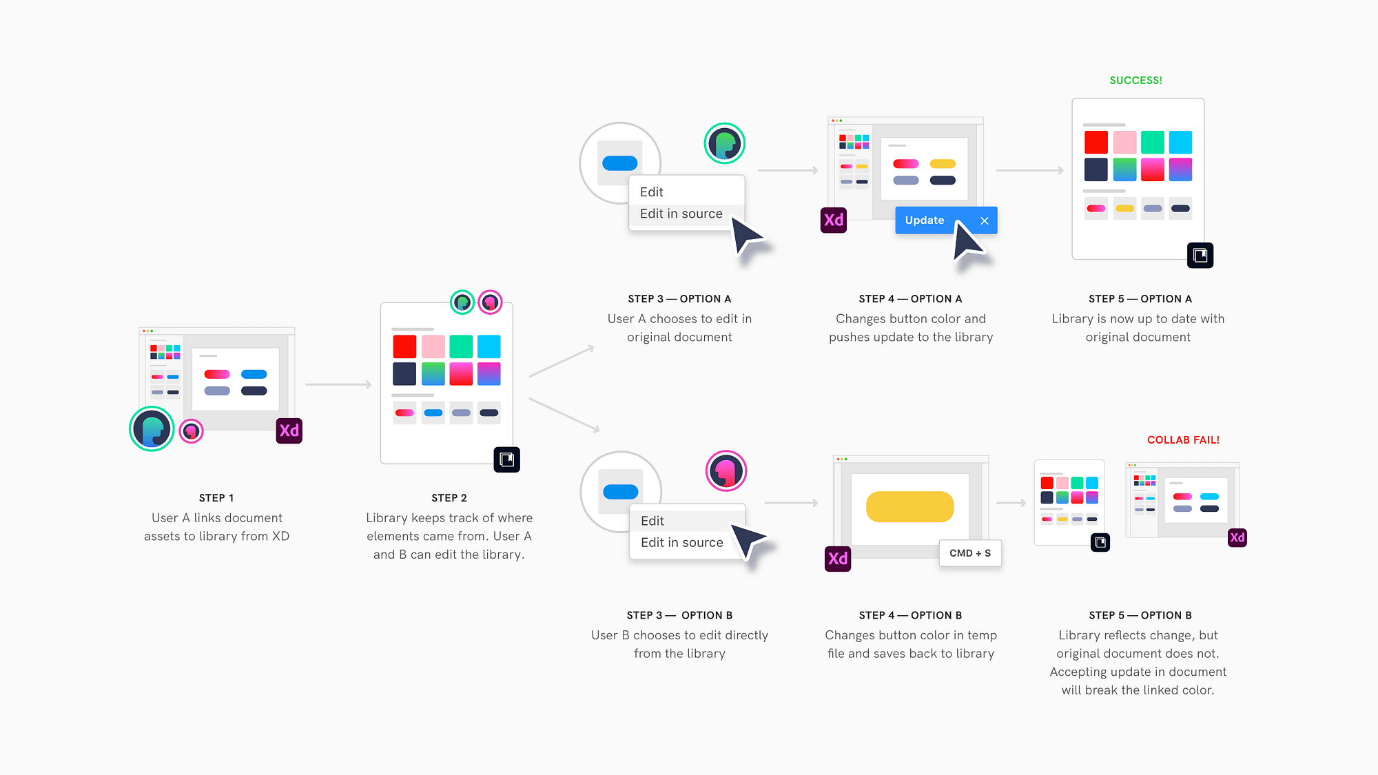
Option A
Library as the source of truth
In our first exploration, the library would be the primary “source of truth” but would also keep track of where elements originated from. This would give people the option to edit elements in their original file.
While this solution was the simplest change from the existing Libraries model, it provided many opportunities for collaborators to make mistakes. If editors could modify an element from either the library or the source file, it would be difficult to keep track of the “correct” version. Modifying an element from the library would also break linked style properties.
Pros
Pros
✓ Good for design systems
✓ Gated updates
Cons
✗ Assumes source file is relevant
✗ Complex permissions
Option B
Document as the source of truth
Next, we considered an option where the original document was the source of truth. Each time you added an element to a library, it was linked from its original source file. Elements could not be edited from the library, but had to be edited in their source file.
While this could have worked well for design systems, it was not scalable to people creating systems in apps besides Adobe XD. It also added a lot of complexity, since collaborators would need to manage access to the library and the many source files.
Pros
✓ Flexible options for authors
✓ Simple permissions
✓ Gated updates
Cons
✗ Can’t link multiple files to library
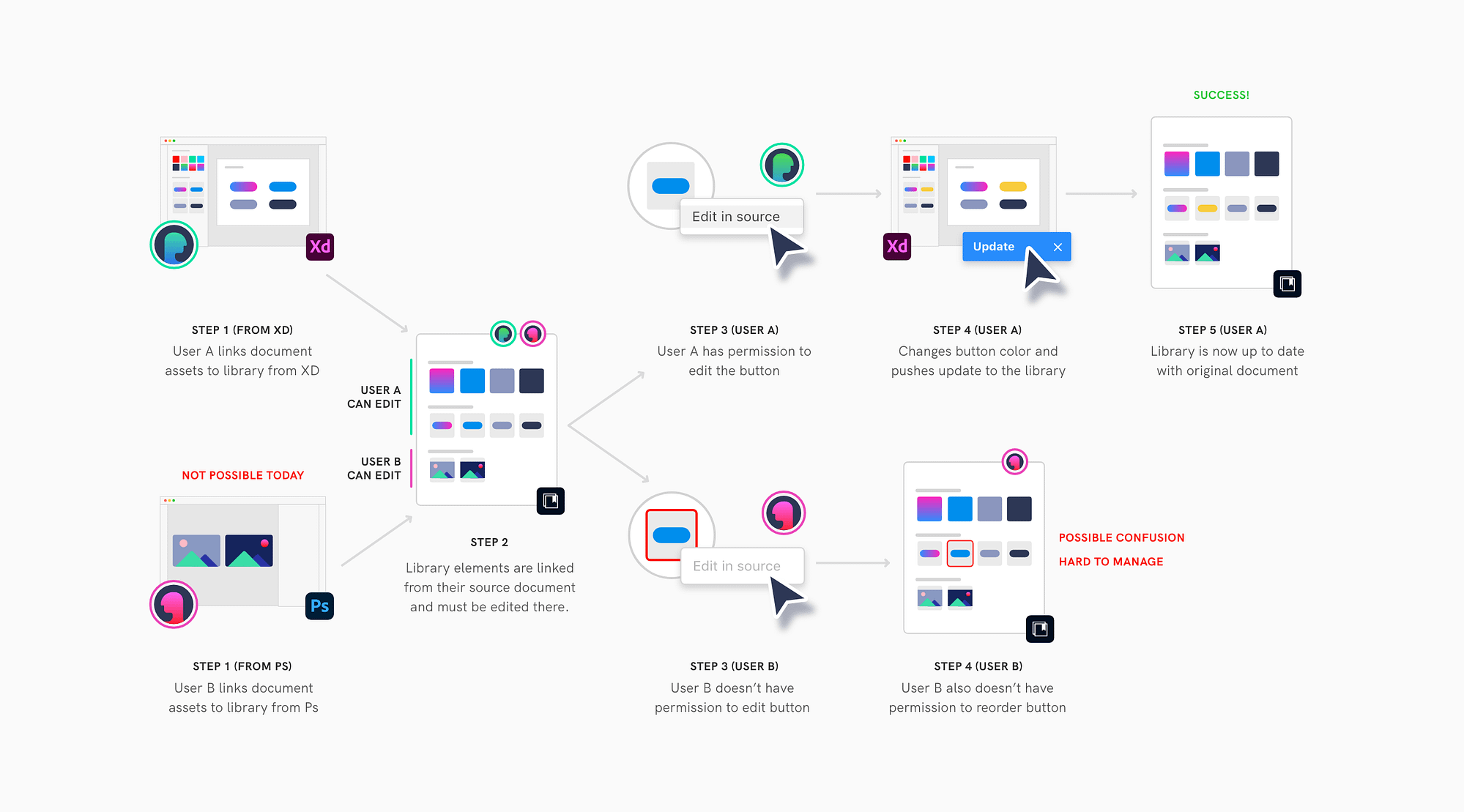
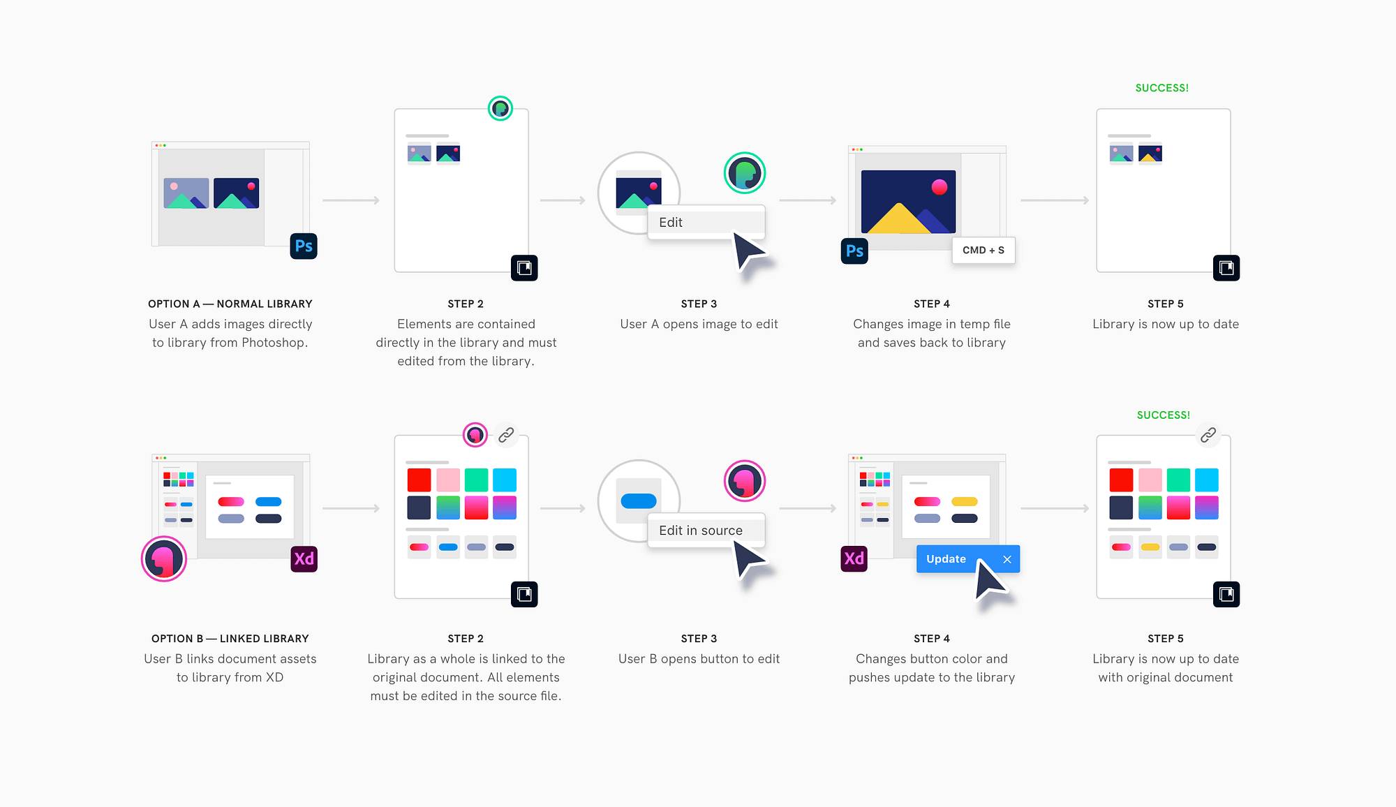
Option C
Link library 1:1 with file
In our final exploration, we allowed people to create libraries in two different ways. People could continue to create self-contained libraries in the traditional way, or they could choose to publish a library directly from an XD file. In this second option, the library would be linked 1:1 with the entire file. People would have to return to the original document to edit the elements.
This conservative approach avoided complex permissions while allowing UX designers to use an XD file as their source of truth and other creatives to use the library itself as their source of truth. This is the solution we ultimately choose to move forward with.
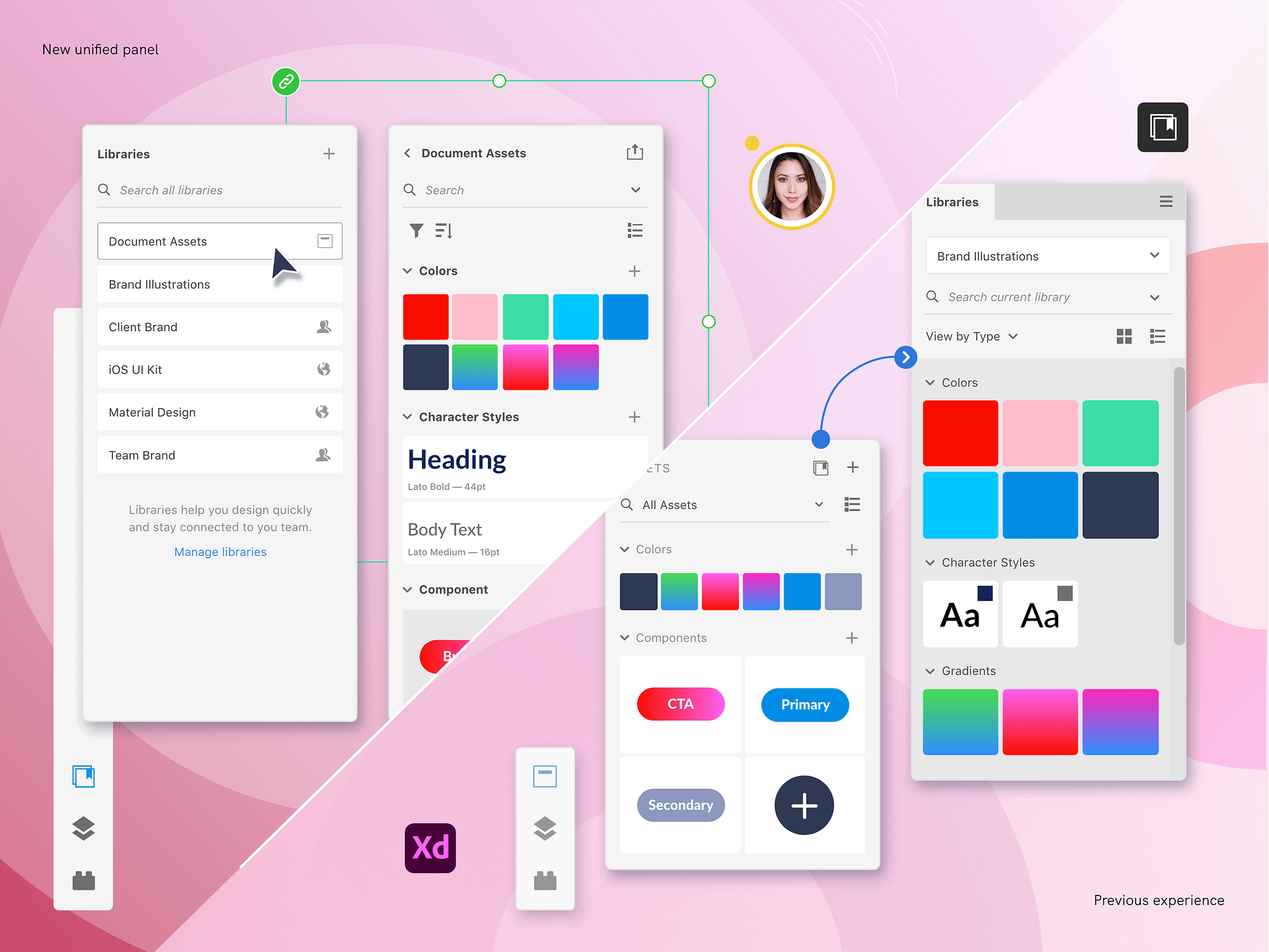
04 - Panel design
Creating a unified panel
Now that the model was established, we needed to resolve the existing two panels. The new, unified panel would allow people to both consume libraries and publish the assets from their document. We explored four different UI patterns to merge these workflows.
Pros
✓ Can search across all sources
Cons
✗ Mixed permissions
✗ Multiple versions of one element
✗ Overwhelming to navigate
✗ Mixed permissions
✗ Multiple versions of one element
✗ Overwhelming to navigate
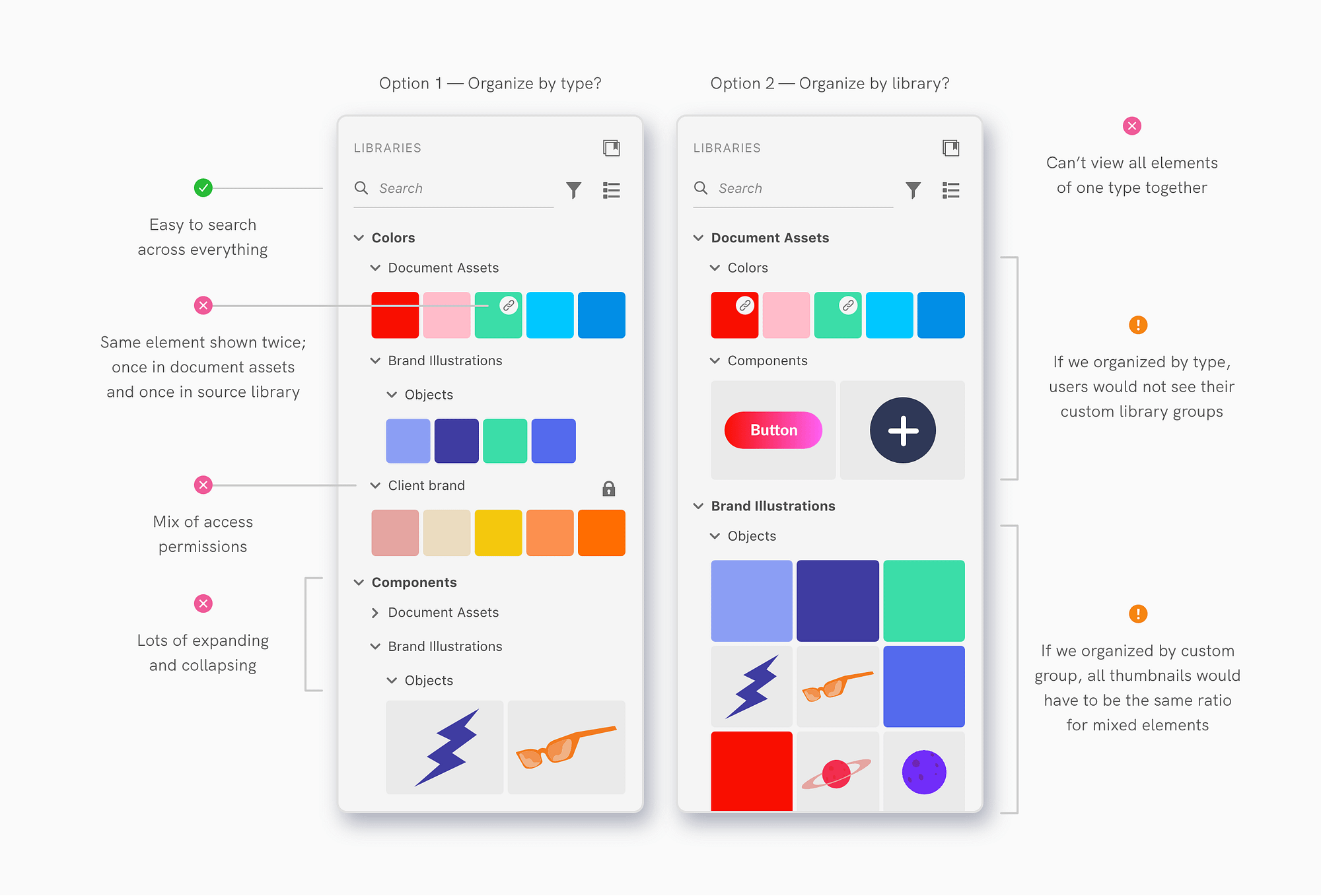
Option A
All-in-one list
First, we explored an option with one view of the panel. Document Assets and libraries were shown on top of each other in a single, collapsible tree of assets. This was the UI solution found in competitor apps like Figma. While this option did offer great for searching across all sources, it was experientially complex.
Pros
✓ Clear to use
Cons
✗ Wrong paradigm
✗ Tabbed panels are legacy UI
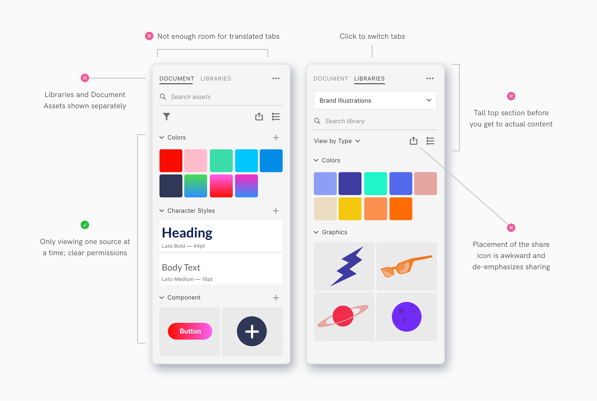
Option B
Separate tabs
For our second exploration, we divided the panel into two separate tabs for Document Assets and Libraries. While this design allowed people to easily switch between Document Assets and Libraries, it did not fit the overall strategy and UI philosophy.
Pros
✓ Right paradigm
✓ One source at a time
Cons
✗ Not scalable to many sources
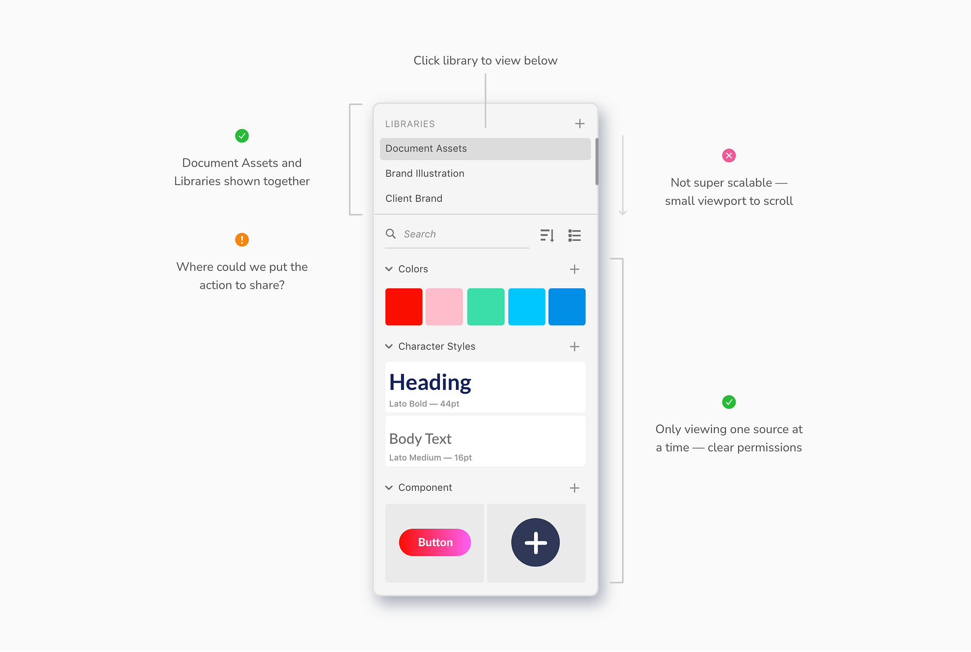
Option C
Top scroll
In our third exploration, the source selected on top controlled the elements displayed below. This was the UI solution found in competitor apps like Sketch and Invision Studio. This solution supported the correct paradigm and allowed users easily switch between sources in a single click, but it wasn’t scalable.
Pros
✓ Right paradigm
✓ One source at a time
✓ Scalable to many sources
Cons
✗ “Feels” like more clicks
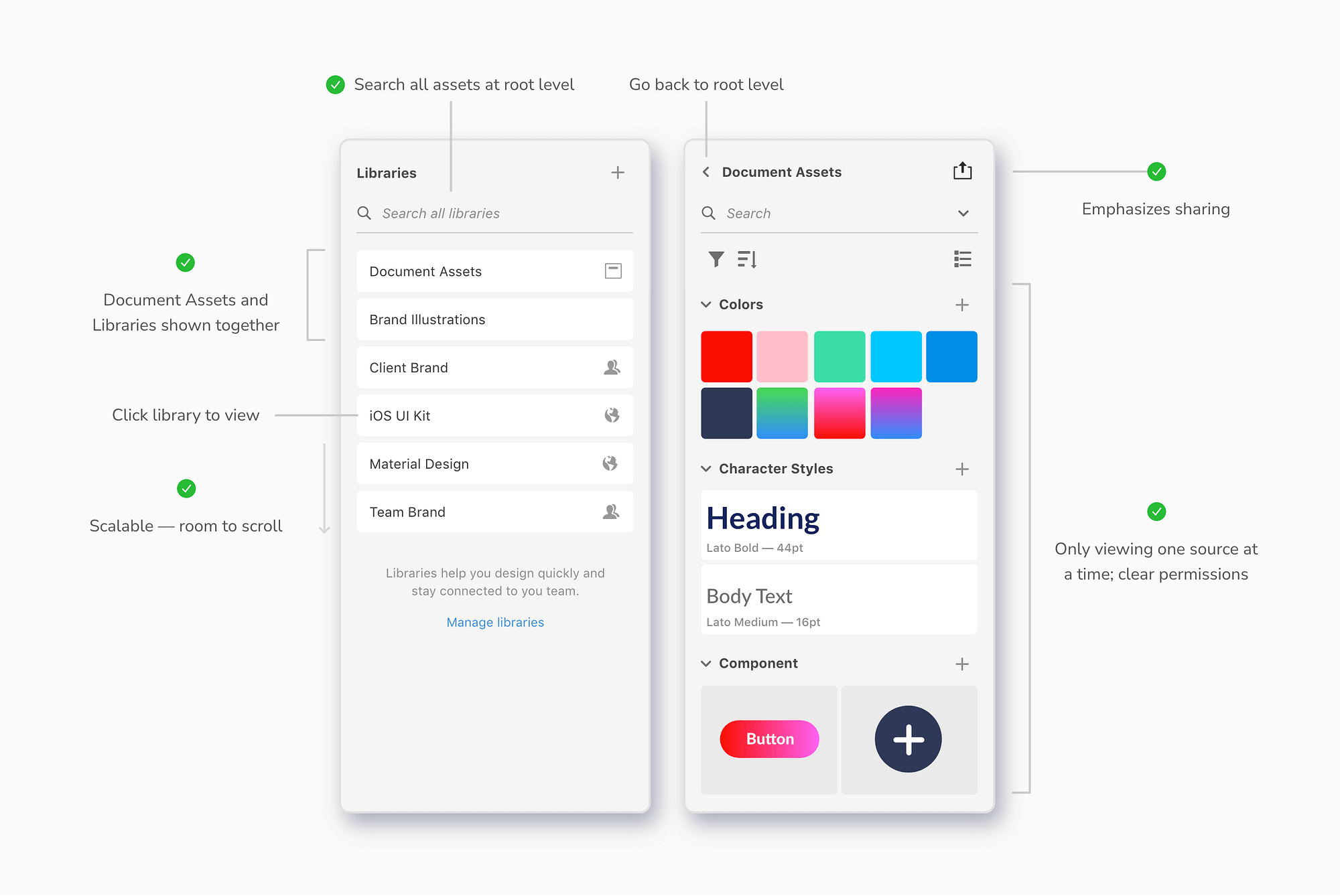
Option D
Drill in, drill out
In our final exploration, people could drill in and out of a root level listing Document Assets and libraries. This was the direction that we ultimately pursued. It had many of the same benefits as Option C, but was also scalable for more libraries. This is the solution we ultimately moved forward with.
05 - Design summary
Additional highlights
While working to define the model and panel UI, we continuously referred back to our original goals to make design decisions. Here's a brief overview of how key features mapped to the principles of context, control, and efficiency.
1. Maintain context
Stickersheet file
Since the source file is linked to the library, authors can continue to use the visual layout of the source file to curate and document their design system.
Design tokens & bulk edits
Editors can make changes to library elements in the source file as a draft. Once they’re satisfied with changes, they can push these updates to the published version of the library.
2. Give control
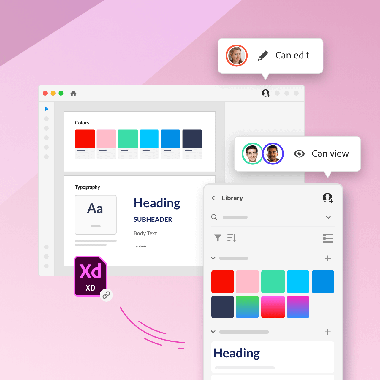
Control who can edit or view
Since the source file and library are now separate (but linked) objects, designers can invite others to view and use the design library without inviting them to edit the source file.
Push updates when ready
Editors can make changes to library elements in the source file and choose when they’re ready to push these updates to the published version of the library.
3. Enable efficiency
Streamlined focus
Designers view one library at a time, but can easily switch back and forth between libraries.
Toggle visibility
From the Library Manager, designers choose which libraries appear in the panel by turning them on and off.
Brooklyn, NY
kelly.a.hurlburt@gmail.com
585.689.9792
Have an opportunity in mind?