ORGANIZING
LIBRARIES
Ship Date
Q4 2020
Role
Lead design
Competitive analysis
User research
Team
3 designers
2 product managers
2 engineering teams
10+ stakeholders
Bringing multi-level organization, responsive scaling, and a fresh visual style to library elements.
Creative Cloud Libraries are a collection of design elements like colors, type styles, graphics, and components that can be shared with your team. While Libraries can serve a range of use cases, they typically house brands or design systems. Libraries can be accessed via the Libraries panel across Adobe applications, giving people easy access to the elements they frequently use and helping teams stay consistent across designs.
At the onset of this project, Libraries only offered very basic organization functionality. Different types of elements could be organized into groups, but groups could be only one level deep. While this worked fairly well for simple brands, it was not a sufficient solution for deeply hierarchical and sophisticated design systems. As the lead designer of the project, I spearheaded the effort to add multi-level organization to Creative Cloud Libraries. This case study highlights some of the core challenges of displaying and organizing nested groups in the Libaries panel.
Design overview

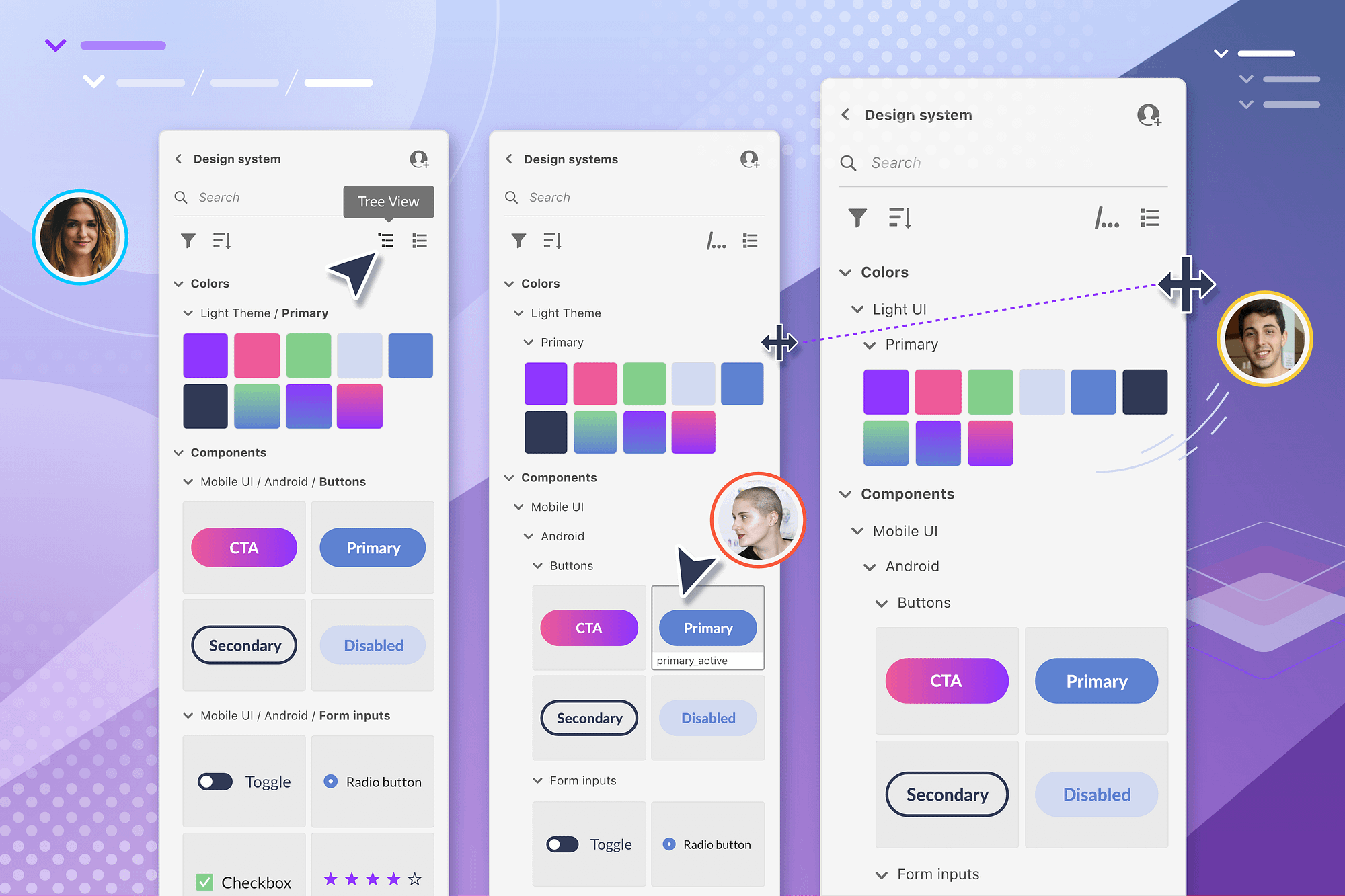
Multiple view options
View your group hierarchy as a conventional folder tree or as a minimized file path. Trying switching back and forth to focus on consuming vs. organizing elements.

Responsive scaling
Element thumbnails and nested groups adjust to the panel width, so they’re always visible and neatly organized.

Contextual scaling
The style and scale of element thumbnails adapt based on grouped content, so they’re always optimized for both reordering and applying to the canvas.
01 - Problem
01 - Strategy
Understanding the challenge
Libraries are integrated across nearly every Creative Cloud app, reflecting an array of creative disciplines. Their functionality needs to serve a range of users with a broad spectrum of organizational needs.
Simple
Sophisticated
Bucket
General bank of assets with no organization applied (i.e. brush pack, media library)
Basic brand
Set of elements with some lightly curated organization (i.e. personal brand)
Advanced system
Highly structured set of interconnected elements (i.e. design system, corporate brand)
From past research, we knew that marketing and graphic design brands typically needed 1-3 levels of organization. In contrast, design systems needed upwards of 5-8 levels. Design components, for example, were often organized in hierarchical groups based on color theme, device theme, style variant, interaction state, and other criteria. While we eventually wanted to provide a way for designers to build these parameters into the component object itself, nested groups were a necessary stop-gap solution.
It was clear to us that the optimal organization pattern for design systems would not necessarily be the optimal solution for simple brands. We needed a solution that would scale to advanced hierarchies without overcomplicating the feature for people with basic organization needs.
“How might we design a system that works for the full spectrum of organizational needs?”
Problem statement
02 - Goals
Defining our design principles
From past user research, we were aware of two main behavioral trends when it came to using libraries. First, users valued the efficiency of having all of their library elements easily accessible at a top level. Unlike their working files, they did not have to drill in and out of multiple levels of folders in order to find the correct brand elements. Second, users tended to prefer visually scanning their elements in the grid view over the text-based list view. While these behavioral trends would undoubtedly be complicated by the addition of more advanced organization capabilities, we wanted to preserve as much of this efficiency value as possible.

Elements first
The elements themselves should be the priority and hero of the panel. Organization should get in the way of visually scanning elements.

Quick access
Elements should be easy to access with minimal navigation and effort. Organization should aid, not hinder people from getting to the right asset quickly.

Create & consume
The solution should work equally well for authors who are organizing the library and consumers who are simply viewing and applying the elements.
03 - Competitive analysis
Reviewing other product solutions
To start the design process, we reviewed the UX patterns of asset panels found in other applications. We quickly realized, however, that few of these tools were working under the same experience constraints as our Libraries panel. Some tools only provided a read-only experience and did not allow people to create or organize inside the panel. Other tools provided a list view but did not provide a grid view. These tools typically relied on integration elsewhere in the application to supplement their experience.
For scalability reasons across the Creative Cloud suite, our Libraries panel was essentially deployed as a self-contained component. It was not possible deeply integrate with individual app UIs at scale. Therefore, our design needed to flex for a range of use cases within the confines of the panel itself. These are a few of the panels we reviewed.
Figma
- Can view components in both grid and list
- Grid thumbnails adjust their size based on the size of the component itself
- Organization is displayed as a name path with all levels left-justified
- Panel is read-only and libraries auto-organized based on the canvas layout
Sketch
- Components view takes over entire application with a traditional folder tree on the left and thumbnails on the right
- Can organize in Component view
- Can also apply elements through a series of cascading menus while working
Photoshop
- Can view shapes in both grid and list view
- Can create and organize elements directly in the panel
- Organization is displayed as a folder tree
- Subfolders and shapes can be intermixed, making the hierarchy difficult to follow at times
04 - UX design
Exploring different UX patterns for hierarchical organization
Our first round of designs included three options. The first option had people linearly navigate by drill in and out of nested groups. We rejected this option outright since it did not support our goal of giving people access to all of their library elements at once.
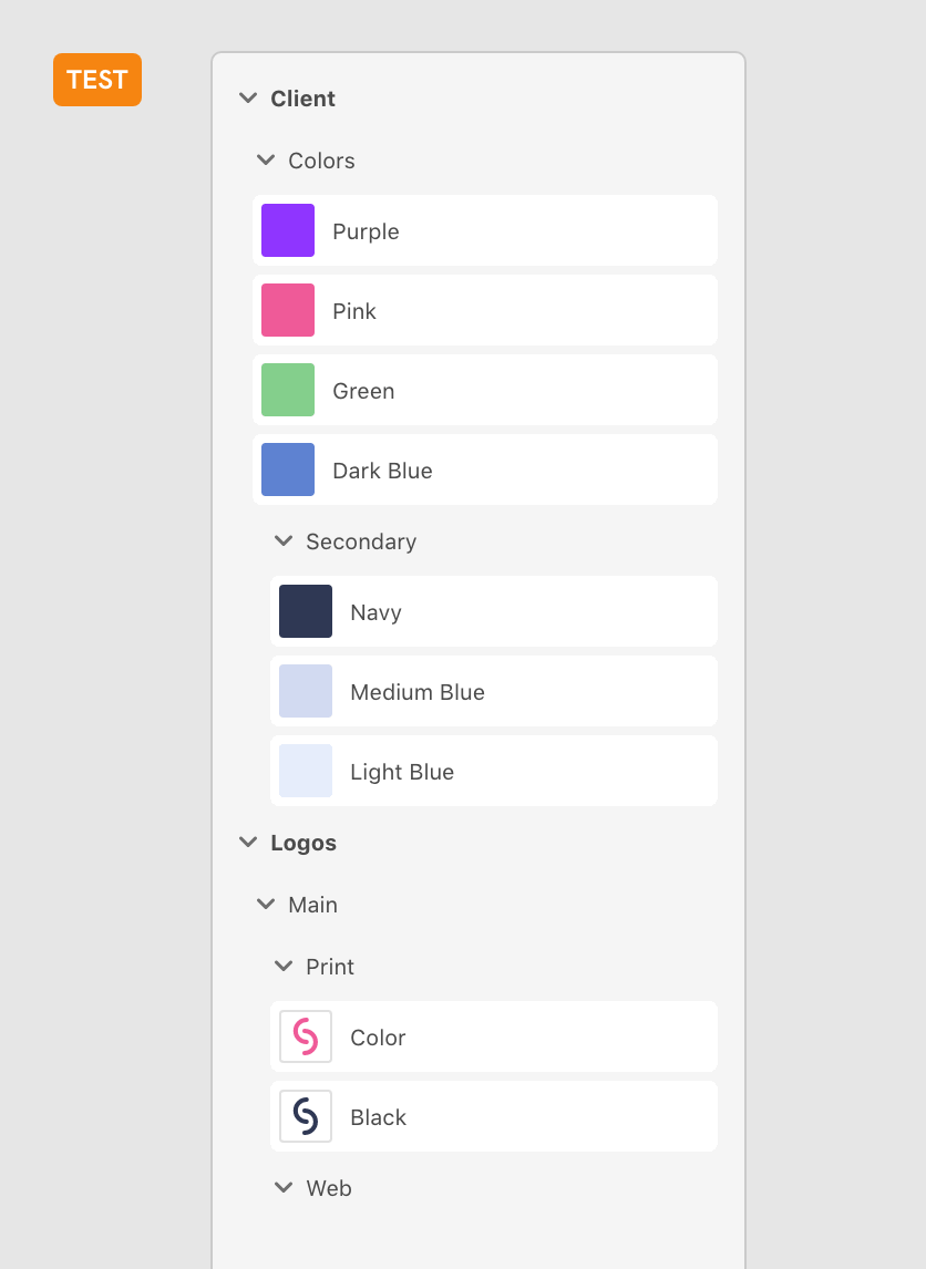
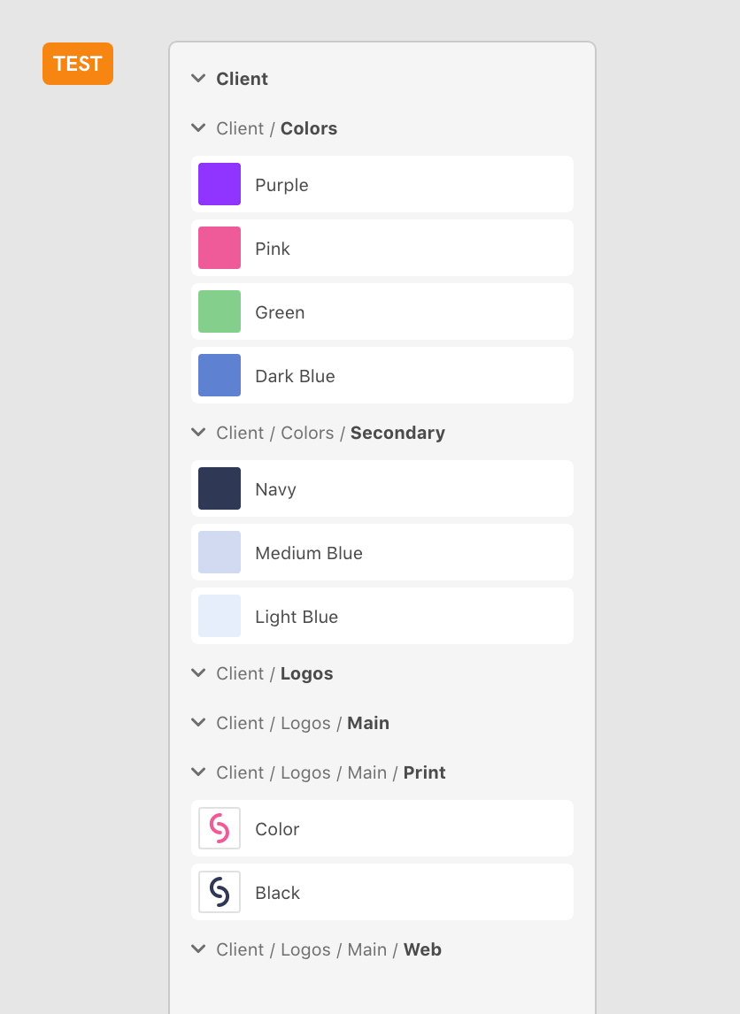
Our second option was a traditional folder tree structure where each level of the hierarchy was indented. Option #3 displayed all levels and elements as left justified. It relied on the slash naming convention to communicate the hierarchy of groups instead of indentation. We decided the compare and test these options with users.
Drill-in, drill-out
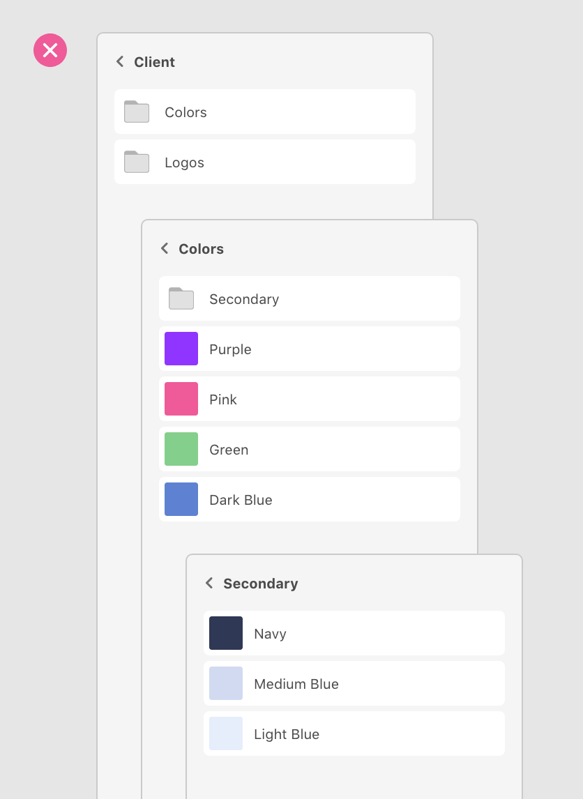
Tree
Path
Research overview
- Moderated interviews
- Remote video call
- 6 participants
User Testing - Round 1
Using Adobe XD, I created a clickable prototype that allowed people to navigate the panel like a working demo. I conducted moderated interviews with 6 participants representing both graphic and user experience designers. During these interviews, I asked participants to complete basic tasks like navigating to specific assets and creating new groups. We then discussed their experience completing these tasks in the two different options. The goal of these tests was to compare comprehension and usability Tree vs. Path view.
Key takeaways
- Strong preference for Tree view across creative disciplines
- Tree view was a more familiar paradigm and less cognitive load to scan
- Tree view made it easier to quickly work out the overall hierarchy of the elements, particularly if you were not the author of the library
- UX designers who had past experience with path naming and were able to grasp Path view more quickly, but Path view was entirely foreign to brand designers
- Reconfirmed that brand libraries would only require 1-3 levels
05 - Iteration
Refining path view
Despite the strong user preference for Tree view, the team believed there was still strategic potential with Path view for UX designers. Adobe XD hoped to capitalize on the slash '/' naming shortcut used in Sketch and Figma as an efficiency. In addition, using name paths would move us towards the ultimate desired experience of building themes and variants into the components themselves. We decided to iterate on Path view and conduct a second round of user testing weighted more heavily towards UX designer participants.
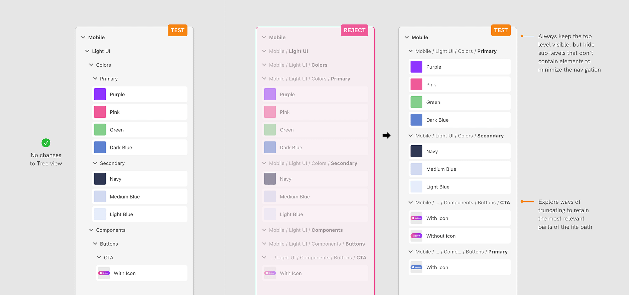
While the Path view had intended to be efficient, it was actually the same amount of expanding and collapsing as Tree view. In our second design iteration of Path view, we hid empty groups in an effort to bring elements more forward. We also looked into smart truncation rules that would prioritize the most relevant portions of the name path.
Revised path view
Research overview
- Moderated interviews
- Remote video call
- 6 participants
User Testing - Round 2
In the second round of user testing, we compared the original Tree view with the revised Path view. I once again as participants to complete basic navigation and organization tasks using a clickable prototype of the panel. While the majority of the participants were UX designers with experience in Sketch or Figma, we ensured that a couple of participants were brand designers.
Key takeaways
- Majority of participants continued to prefer the Tree view as lesser cognitive load
- UX designers with more of an engineering background quickly grasped and preferred using Path view
- Participants expressed concern with the potential scale of assets and their ability to keep track of their position in large libraries with lots of elements
- Condensing the library by removing empty groups made elements easier to scan but simultaneously made organization much more difficult (and sometimes impossible)
06 - Final layout
Final layout design
After the second round of user testing, the Adobe XD still believed in the strategic importance of name paths in setting up future design systems work. Yet, we knew that Tree view would be the more comfortable and intuitive experience for the majority of users. To accomodate both user andd business goals, we decided to have the Libraries panel support both view options. We made some additional updates to improve the scanability of the hierarchy and enable organization tasks in Path view.
Multiple views
We allowed users to view their organization in both Tree and Path views, and positioned the views as expanded and condensed versions of the same hierarchy. We also continued to allow users to view their elements as a grid or list.
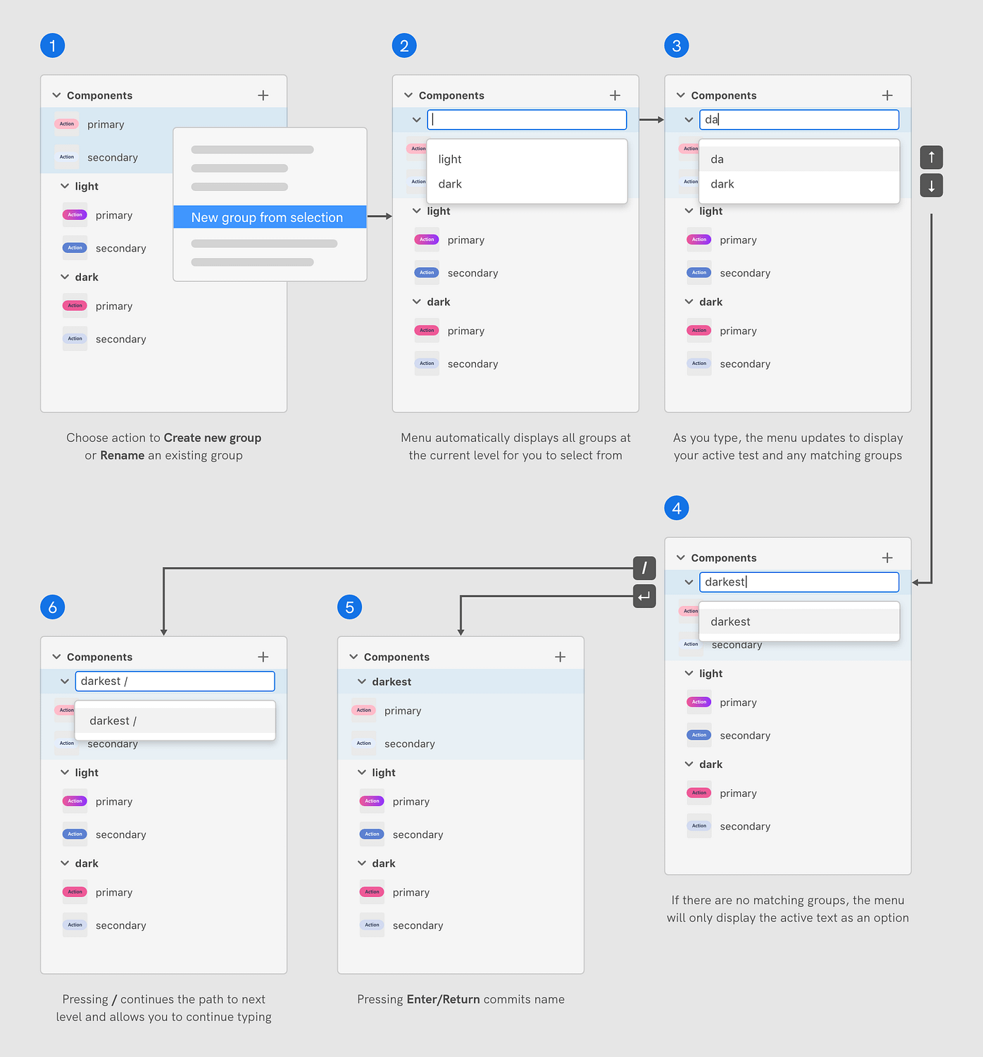
Edit path helper
To make organization possible in Path view, we introduced a helper menu when creating or renaming groups. The menu would suggest matching groups as the user typed their name path, making it easier to organize elements into existing groups without mistakes. Users could nest elements multiple levels deep simply by using the name path '/' convention.
Improve list view
We removed the white backgroud from elements to create a more traditional list view where the hierarchy was easier to scan.
07 - Responsive design
Making nested groups responsive
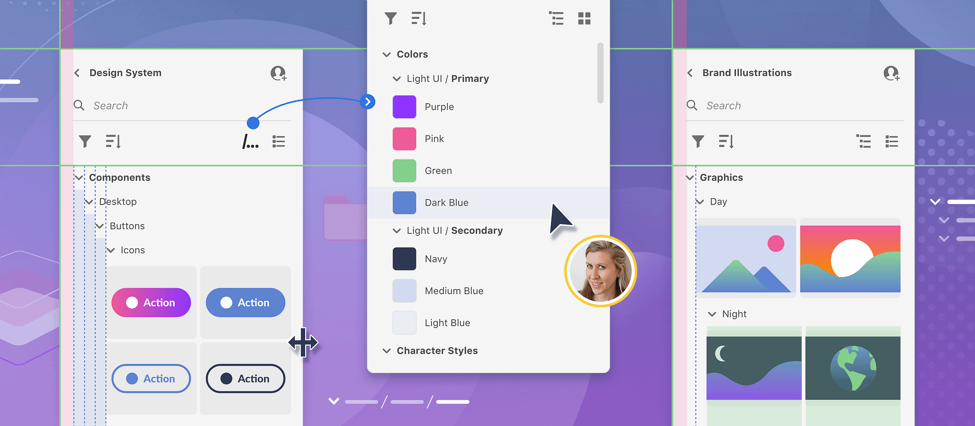
Another critical design consideration was how to handle libraries with many levels of nested groups. Other panels we reviewed seemed to "handle" deep hierarchies in one of two ways. The first way was to implement a horizontal scroll. The second way was to simply cut off elements that extended beyond the panel width. Both of these solutions felt awkward and sub-optimal to us.
Since our design principles were focused on efficiency and celebrating the elements, I felt it was important that all elements be visible without needing to scroll in two directions or expand the width of the panel (which took up vital canvas space). Instead of having elements with a fixed size, I devised a solution where elements instead had a fixed number of columns with variable width. As a result, elements were subtly different sizes at different levels of the hierarchy, but they were always visible in their entirety.
Horizontal scroll
Right-side crop
Solution
Because the column widths were going to decrease with each level of hierarchy added, I wanted to make sure the elements remained a reasonably large size. At the same time, I wanted to make sure that the indentation between levels was also large enough to quickly scan the hierarchy. Rather than have a fixed amount of indentation, I created rules that determined the amount of indentation based on the panel width and the number of levels in the overall hierarchy. Libraries with deep hierarchies (which would be much less common than simple hierarchies) would have a smaller amount of indentation, but these users could expand the width of the panel to make this difference more dramatic if needed.
08 - Contextual design
Making thumbnails contextual
Our final design consideration was to decide how to display different types of elements. Many other asset panels were organized strictly by asset type, allowing specific kinds of elements to have bespoke representations. Our system allowed any type of element to be organized together into the same group. This provided more flexibility but made it more difficult to display elements in a way that best reflected their unique attributes.
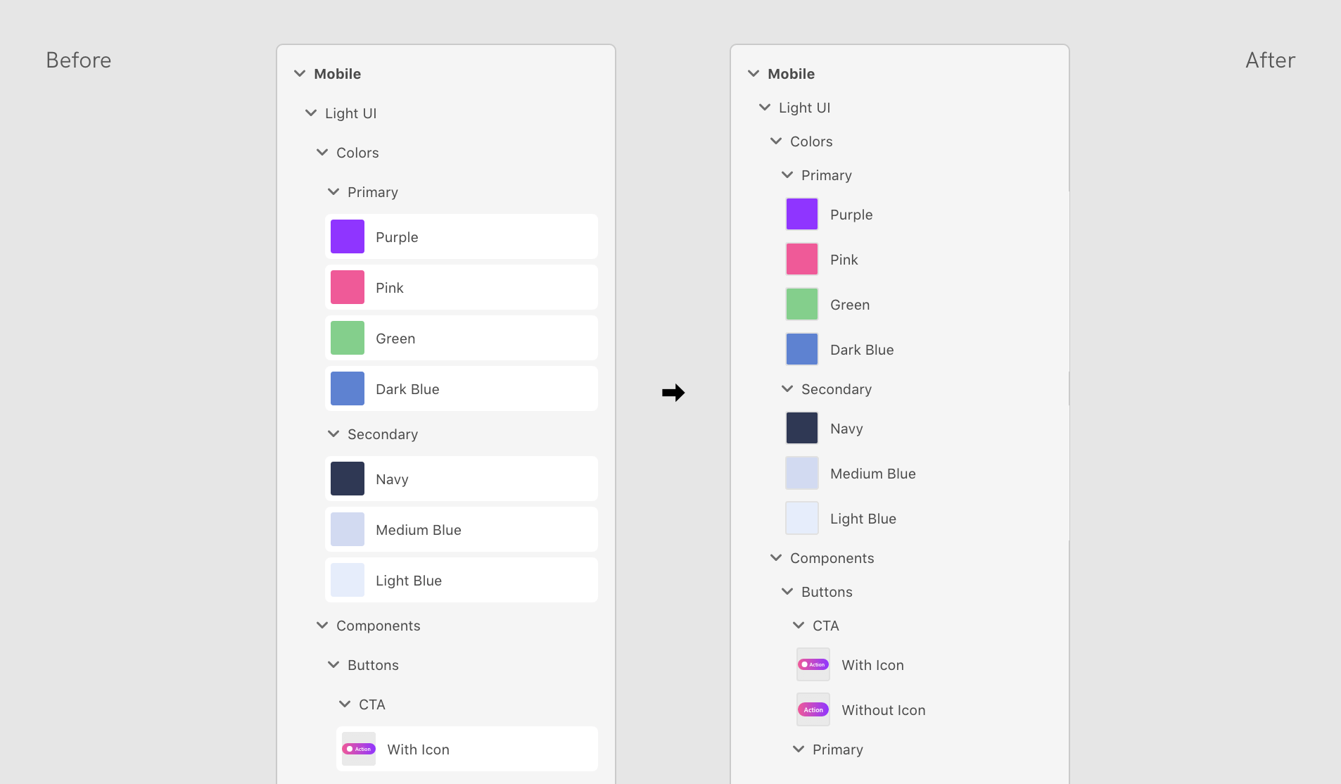
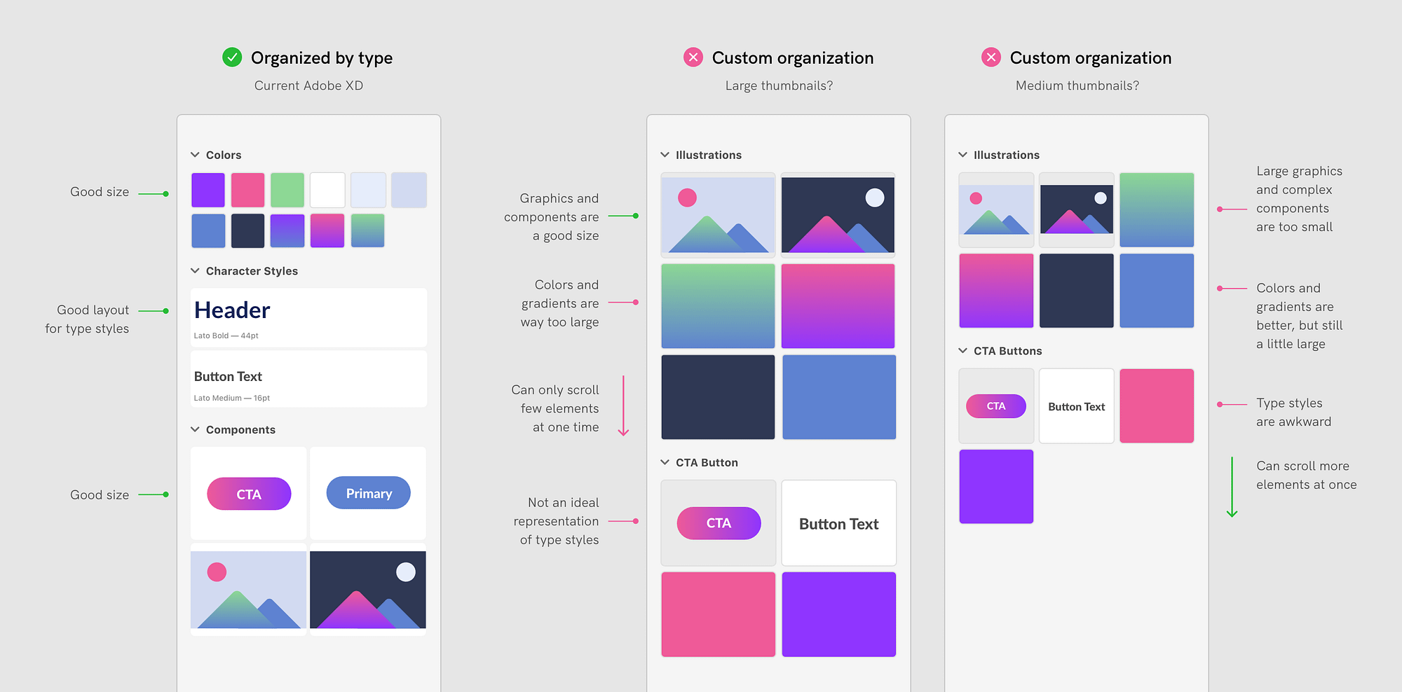
From qualitative research, we knew that the majority of Libraries users mainly organized their elements along type categories despite the flexibility provided. I devised a solution where each type of element was assigned one of 4 ratios by default. If a group contained only elements with the same default size, they would display at that unified default. If a group contained a mix of default sizes, all elements in that group would display at the largest of the default sizes. This optimized for the majority of library elements to be displayed at their ideal ratio while still providing a solution for when users intentionally mixed element types together.
Problem overview
Solution
09 - Delivery
- UI specs
- Accessibility specs
- Design library
Handing off designs
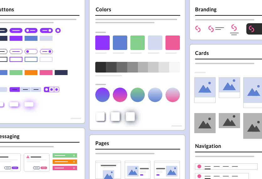
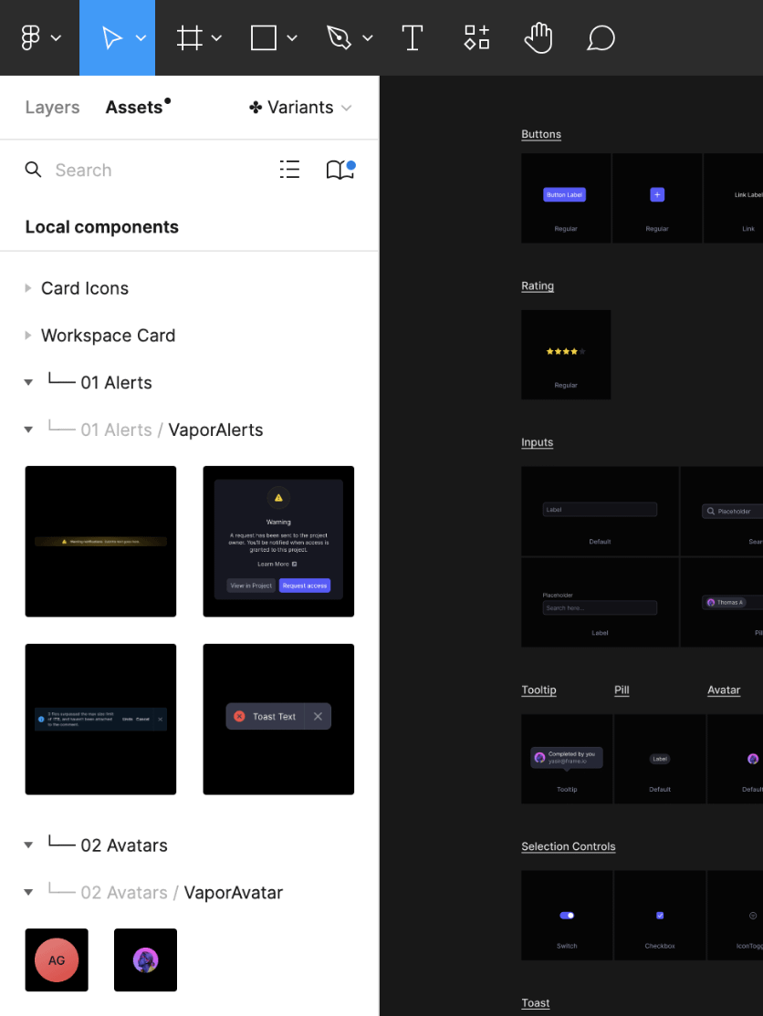
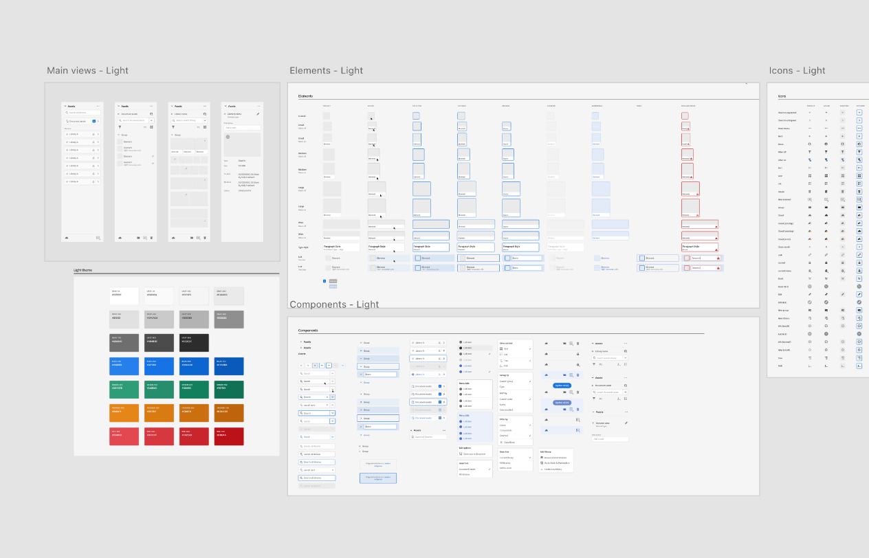
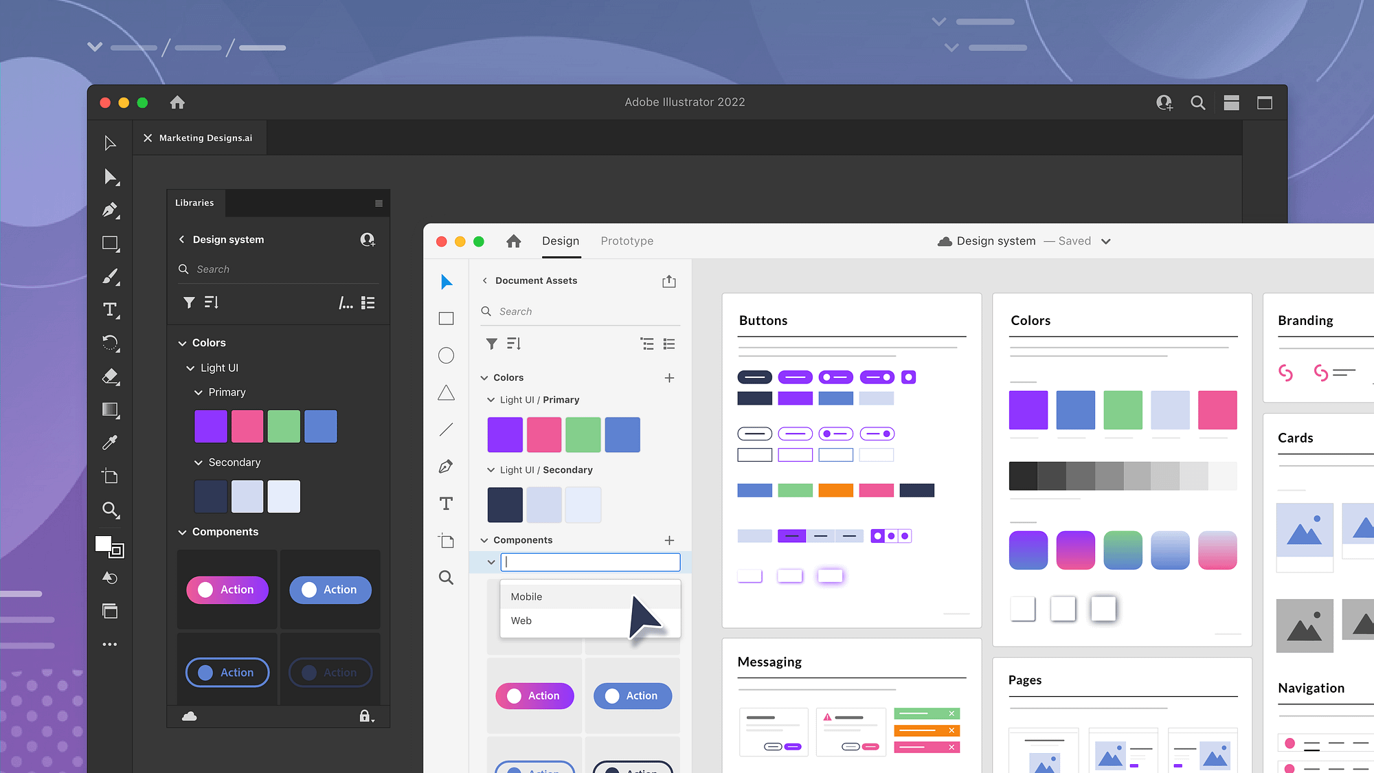
Prior to this project, the Libraries team did not have a UI kit to work from, and each new feature provided a different set of specs to engineers. This meant that UI components had to be recreated with each new design file, and there was no source of truth for the overall UI specifications of the Libraries panel. I felt that this project was the perfect timing to finally implement visual guidelines and a design library for the team.
I created detailed specs of the panel's functionality, visual design, keyboard navigation, and accessibility labels. I also built out the panel as library with colors, type styles, and multi-state components. These artifacts were intended to be living document that were updated by designers with each new feature. Engineering could now refer to a single document for the latest, accurate panel UI.
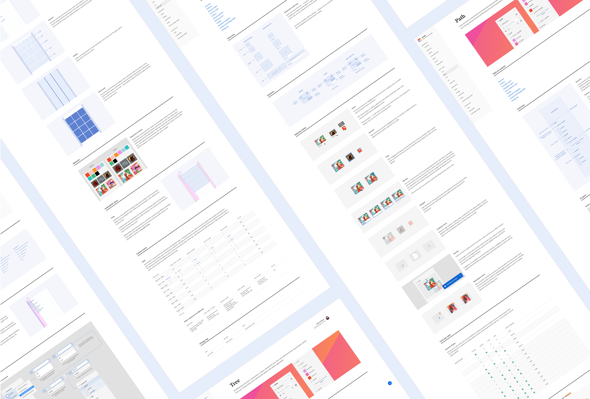
The UI specs were laid as pages and hooked up as web page prototype for easy viewing
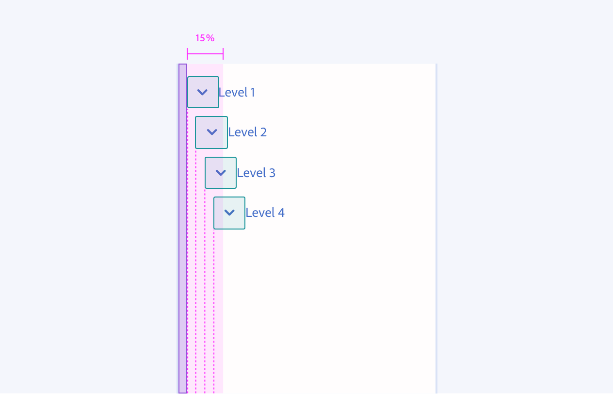
Close-up of indentation diagram
Some of the artboards used to create components with states
Brooklyn, NY
kelly.a.hurlburt@gmail.com
585.689.9792
Have an opportunity in mind?